Category Archives: Charts

How African Countries Compare to One Another

scoring africa

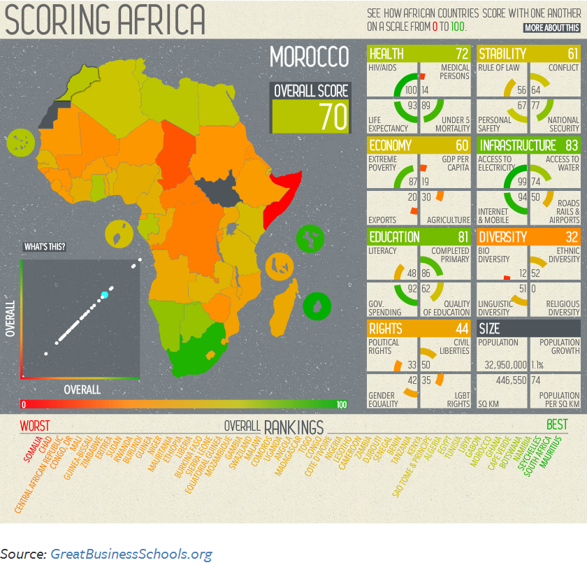
The African continent is home to 54 countries ranging from prosperous ones to countries that are plagued by violence and extreme poverty.

The chart above shows how African countries compare with one another, taking into account different indicators such as human rights, education, the state of the economy, political stability, the diversity and size of its population, and access to healthcare.

Countries with the highest score (best) include Mauritius, South Africa, and Seychelles. Countries with the lowest score (worst) include Somalia and Chad. In between these two extremes there are a wide range of countries performing well in some areas, and not so well in others.

Source: PolicyMic: This Awesome Interactive Map Will Make You Think Twice About Africa


How Americans Spent Money in 2012


how americans spend money

Housing, food, transportation, and clothing account for an estimated 66% of income spent for an average American household in 2012.

According to The Atlantic, housing, food and clothing account for more than 60% of expenses for the poor. Basically, most of their income is spent is covering basic needs and not much, or none, is left for savings. The rich, by contrast, have a larger margin that can be spent in entertainment, insurance, and savings.

Source: The Atlantic: Where Americans—Rich and Poor—Spent Every Dollar in 2012


Europe’s Loss-Making Cars

europe biggest loss-making cars 2013

European car makers are having a hard time with some of their models, which have generated big losses for the industry in the region. Here is a chart that shows European car manufacturers, their respective loss-making models, and how much money they lost per model.

Source: The Economist: Zoom, sputter, aagghhh!! – The biggest loss-making cars in Europe


Unplanned Pregnancy By State Across the United States

2013_09_UnintendedPrenancies

Nearly half of the total 6.7 million of pregnancies taken place in the United States every year are unintended pregnancies. Although the unintended pregnancy rate has remained relatively constant in the last three decades, the rate among poor women has seen a dramatic increase, especially in the South, and in cities with a large population.

Public funds are used to cover the huge cost of such unintended pregnancies. Avoiding unintended pregnancies though the funding of public family planning centers constitutes a better use of those funds. In 2008, $1.9 billion were destined to fund public family planning centers across the U.S., which resulted in savings of $7 billion, resources that would have been used to cover for the unintended pregnancies otherwise.

Source: The Huffington Post: The Geography Of Unintended Pregnancy (INFOGRAPHIC)


Minutes of Minimum-Wage Work to Buy a Big Mac Burger

minutes of work for a big macUsing the criteria of the Big Mac Index developed by The Economist in 1986 as a way to measure if currencies are valued at the right level, the International Business Times created this visualization showing how many minutes a minimum-wage worker needs to work in order to buy a Big Mac burger.

As it turns out, a minimum-wage worker in Afghanistan needs to work 372 minutes (6.2 hours) in order to buy a Big Mac burger. In contrast, a minimum-wage worker in Australia needs to work only 18 minutes to buy a Big Mac burger.

Source: International Business Times: Minutes Of Minimum-Wage Work To Buy A Big Mac: 36 minutes in the US, 6 hours in Afghanistan


The United States Leads in Mobile Monetization

us leads in mobile monetizationAccording to Statista global revenue from mobile advertising almost doubled in 2012, increasing from $4.9 billion back in 2011 to $9.1 billion.

In North America alone, the amount spent on mobile ads per mobile subscription reached $9.39 on 2012 compared to $4.53 on the previous year. That fact puts North America as the leader in mobile advertising worldwide. Western Europe follows with $2.91 spent on mobile ads per mobile subscription, more than double the amount spent on the previous year.


China at the Top of Renewable Energy Investment

china leads energy investmentIn 2012 China’s investment in renewable energy surpassed the investment by the United States for the previous year and for the same year. In fact, China’s is ahead every other nation including Germany, Japan, and Italy.

China’s investment in renewable energy exceeded $60 billion for 2012, compared to an estimated $36 billion in the United States, and $23 billion in Germany for the same year.

Source: Statista: China Leads the Way in Renewable Energy Investment


Deaths from Organized Internal Conflict

deaths from organized internal conflictThe number of deaths as a result of internal armed conflicts has increased dramatically from 37,300 back in 2007 to 178,300 in 2012. Internal conflict is defined as armed conflict between two parties, one of which is the government of that country.

For 2012, the largest number of deaths have occurred in Syria (40.9%), Libya (17.3%), Mexico (14.2%), and Pakistan (5.2%). The areas of major conflict have switched from Iraq and Afghanistan back in 2007 to Syria and Libya in 2012.

Source: The Economist: Syria v Libya v Iraq – A numerical evaluation of recent conflict


Stock Performance of Selected Internet Companies in 2013

stock performance of selected internet comanies 2013The year 2013 has been a good year, so far, for selected internet companies. In this chart by Statista we can see the percentage change since January 2013 to July 12, 2013 for the stock performance of companies like Yahoo, Google, Amazon, etc.

The best performer has been LinkedIn with a 77.5 percentage change since January 2013. LinkedIn is followed by Yahoo, Google, AOL, Amazon, and eBay. Facebook, on the other hand, has seen a decline in its stock performance in the same period of time.


Oil Production and Consumption by Country

oil production and consumption since 1965When it comes to oil production and consumption, countries have a very close relationship of interdependence with each other. Some countries consume more oil than what they produce relying on imports to satisfy their internal demand. Others, consume less than what they produce, being able to export oil to nations that need it.

Oil consumption (yellow) for the United States, for example, was larger than its production (grey) for 2012, 18.55 mb/d (million barrels per day) compared to 8.9 mb/d, importing more than double its production to satisfy the gap in internal demand. Other nations with oil consumption higher that oil production include China, Brazil, Australia, India, UK, and Indonesia.

In contrast, oil consumption for Saudi Arabia for 2012 is estimated at 2.94 mb/d, while its production reached 11.53 md/d, exporting its oil surplus to the rest of the world. Other nations whose oil production exceeds its oil consumption include Canada, Mexico, Venezuela, Norway, Russia, Kuwait, United Arab Emirates, and Qatar.

Source: Winston Smith Labs: Global Oil Production and Consumption since 1965 [Interactive Map/Graph]