Category Archives: Agriculture

Hunger Map 2012

mdg hunger map 2012One of the targets of the Millennium Development Goals (MDG) is to reduce the number of people with hunger by half by the year 2015. An estimated 870 million people still suffer from hunger around the world.

This map published by the Food and Agriculture Organization of the United Nations (FAO), shows that a good number of developing nations have made progress toward reaching that goal, as can be seen for the countries in green, with East Asia and Latin America as the top performers. On the other hand, many countries in Africa and West Asia have not made any progress, or worse, their situation has even deteriorated as can be seen for the countries in yellow or red.



Industrial Water Consumption by Country

Across the globe, freshwater is consumed by four different economic sectors: domestic, industry, energy and agriculture. The agricultural sector is the largest consumer of water. The industrial and energy sectors follow suit, using 20% of available water resources.

This map (above), published by the Sustainable Sanitation and Water Management Toolbox, shows how much water is used by the industrial sector by each country. For the year 2009, the largest consumers of water for industrial use were the U.S. and Europe. Water consumption by the industrial sector accounted for 50% of total water use.


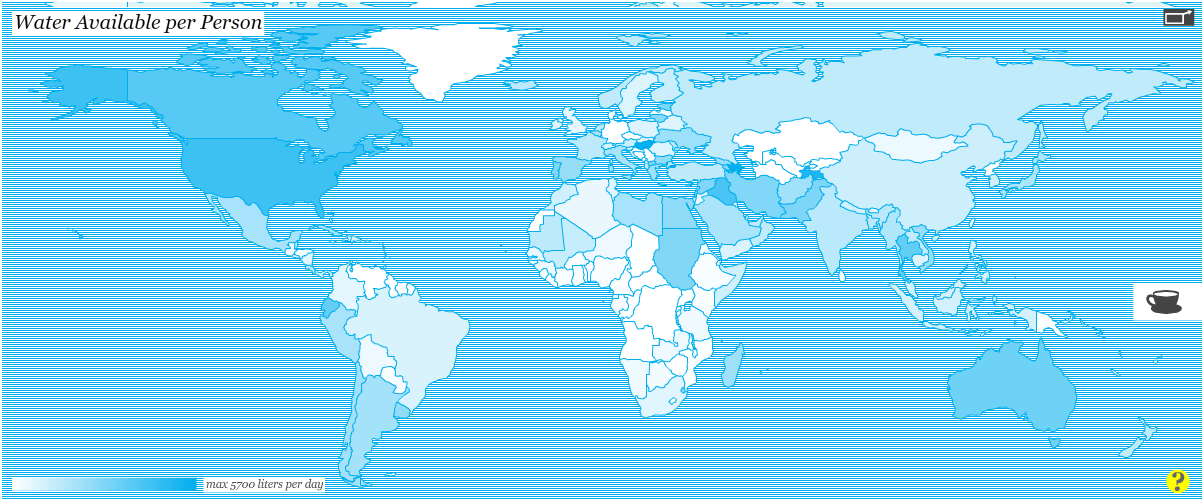
Water Available Per Person Worldwide

click to enlarge

March 22, 2013 has been designated World Water Day by the United Nations. In that regard, we wanted to see how much water is available per person per day across the planet.

The map above, winner of the Urban Water Design Challenge for Interactive Water Footprint Infographic at Harvard University, shows how much water is available for each person in a single day in each country.

Countries with the largest amount of water available per person per day (dark areas) include: the United States (4,382 litters/day), Canada (3,796 litters/day), and Ecuador (,3516 litters/day) in the Americas; Hungary (5,704 litters/day) in Europe; Azerbaijan (5,619 litters/day), Iraq (4,060 litters/day), and Tajikistan (5,033 litters/day) in Asia; Sudan (2,822 litters/day), and Egypt (2,527 litters/day) in Africa.

For the interactive infographic and other interesting visualizations about water, please visit: Circle of Blue: Harvard Students Win Urban Water Design Challenge for Interactive Water Footprint Infographic 

Forest Areas as a Percentage of Land Area Worldwide

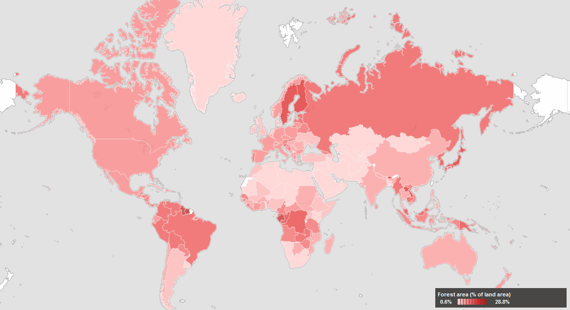
March 21, 2013 has been declared the first International Forest Day by the United Nations. In that light, we decided to take a look at one key environmental indicator that measures the percentage of forest area present in different regions of the planet.

The map above, created by the World Bank depicts forest areas as a percentage of land area for each country. Forest area is defined as land, natural or planted, under groves of trees of at least 5 meters (productive or not), excluding tree groves in agricultural production systems.

Countries with the highest forest area as a percentage of land area (dark red areas) include: Guyana, Suriname, and Belize in the Americas; Finland and Sweden in Europe; Bhutan, Laos, Japan, South and North Korea in Asia; Guinea, Gabon, Democratic Republic of Congo, Congo, and Guinea Bissau in Africa; Papua New Guinea in Oceania.


Milk Consumption Per Capita Worldwide

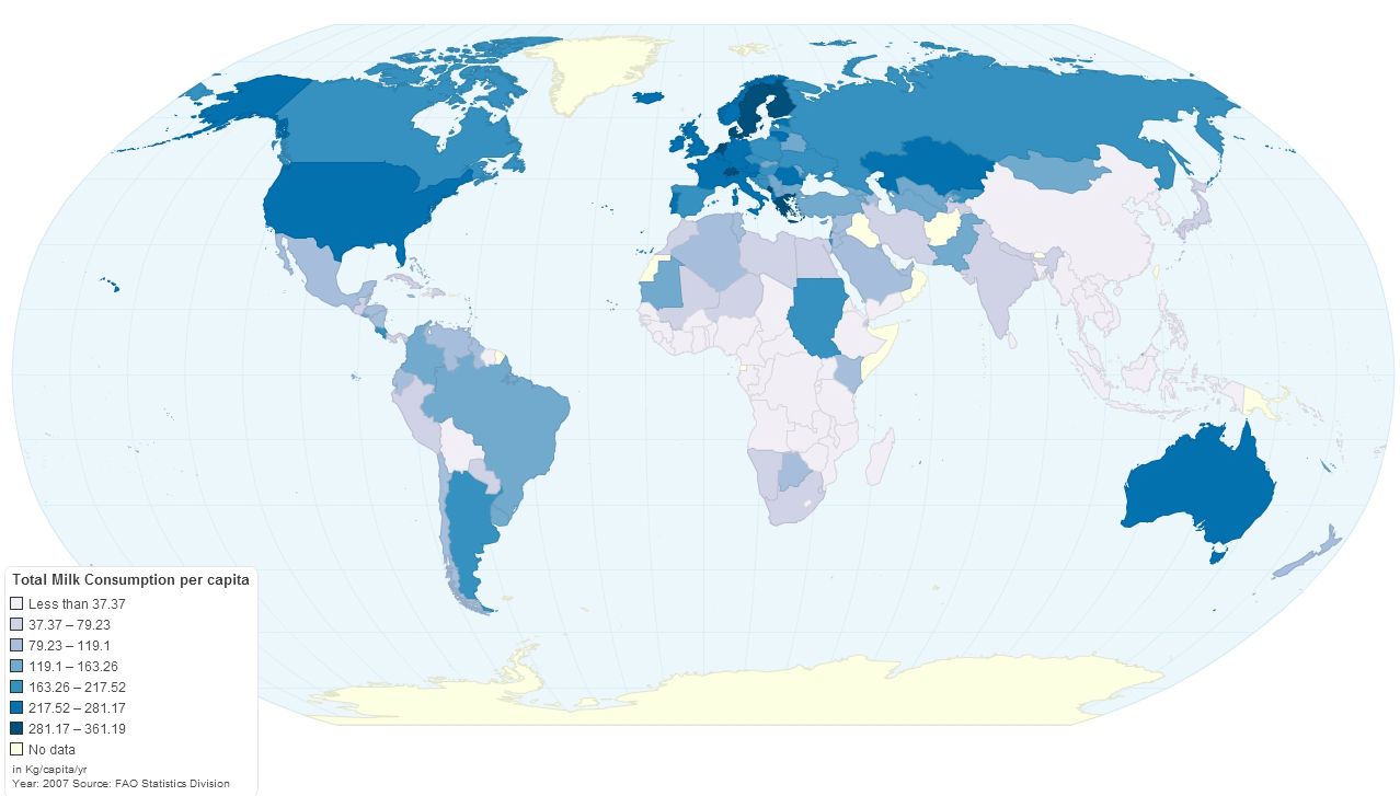
Milk and milk products are consumed all over the world on a daily basis. As shown in the graph above, the largest consumers of milk in the Americas are the U.S., Canada, Nicaragua, and Argentina. In Europe the largest consumers of milk are Sweden, Finland, Netherlands, Switzerland, Portugal, Greece, and Kazakhstan. In Africa, we have Sudan and South Sudan. Australia is also one of the largest consumers of milk.

The consumption of milk in this map is defined as Kg. of milk consumed per person per year.

Resource: Food Beast: Map of Milk Consumption & Lactose Intolerance Around the World


Food Exports and Imports Worldwide

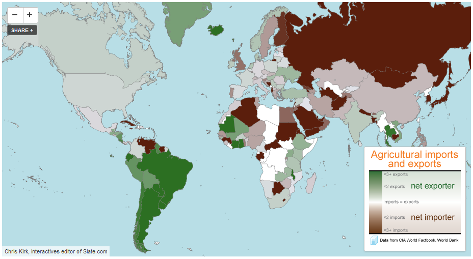
Some countries are net exporters of food (their food exports are larger than their food imports) while others are net importers of food (their food imports are larger than their food exports).

Among the net exporters of food we find the majority of South American countries, with the exception of Venezuela and Suriname, the United States, Canada, Mauritania, Indonesia, Australia, and a few African countries such as Mauritania, Ivory Coast and Ghana. The largest net exporter of food, by far, is Argentina with $23.42 of food exports per every $1.00 of food imports. Argentina is followed by Brazil, New Zealand, Paraguay and Iceland.

Among the net importers of food we find countries such as Russia, Finland, Sweden, the UK, Italy, Germany, Portugal, Sudan, Cuba, Saudi Arabia, Japan, etc. The largest net food importer is Eritrea, with $0.01 of food exports per every $1.00 of food imports. Eritrea is closely followed by Venezuela, Turkmenistan, and Algeria.

Data for for both agricultural exports and imports are for 2010.

Source: Slate.com: Maps: Agriculture in the U.S. and Around the World


Record Warm Temperatures Registered in 2012

click to enlarge

Temperatures for the U.S. contiguous states in 2012 were 1 degree Fahrenheit warmer than the previous record temperatures of 1998. Based on preliminary data the National Oceanic and Atmospheric Administration (NOOA) created the map above, where it can be clearly seen that across the nation warmer temperatures were registered. Nineteen states from Massachusetts to Utah, experienced record warmer temperatures.

2012 was also a year of record low levels of precipitation, below average. Drier than average conditions affected the central parts of the United States, with negative consequences for agriculture. The winter season 2011-2012 was affected by higher than normal warm temperatures as well.


Bleak Estimates for Corn Yields and Grain Stocks for 2012

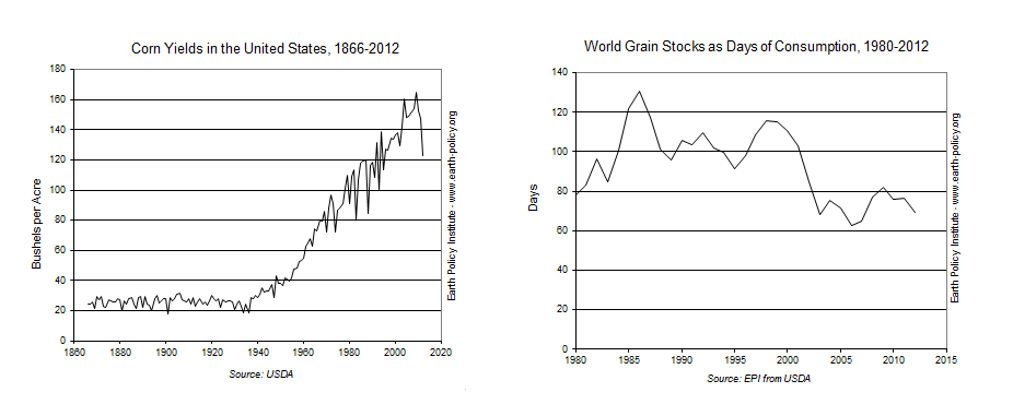
According to the Earth Policy Institute, drought conditions have generated bleak corn yield estimates for the remainder of 2012. Corn yields for September 2012 are estimated at 123 bushels per acre, which would make it the lowest yield since 1995. Compare this yield to the highest ever value of 165 bushels per acre, which was last reached in 2009.

As a consequence, the price of corn has increased significantly. It reached a record high of $8 per bushel in the corn futures market back in July, and has fluctuated around that price since then. Another consequence is the expected fall in global grain supplies. Supplies are expected to fall to 432 million tons, or 69 days of global consumption.

World Supply of Biggest Crops Decline and Food Prices Rise

The worst drought in fifty years has caused a decline in the stockpiles of crops such as corn, soybeans, rice and wheat, with the subsequent all-time increase in the prices of corn and soybeans. Good news for commodities investors.

The drought has also affected fuel and power production which, in turn, have a negative effect on food prices. Read more…

  1. Unfavourable weather behind the July rebound of the FAO Food Price Index – FAO Food Price Index [Food and Agricultural Organization of the United Nations]
  2. America’s disastrous corn harvest will hit world’s poor hardest [The Guardian]
  3. World food prices rising in response to drought damage in the US – Ole Hansen [TradingFloor.com]
  4. Global food reserves falling as drought wilts crops – Tony C. Dreibus and Elizabeth Campbell, Bloomberg [Futures Magazine]
  5. USDA slashes corn yield, production forecast – Bill Tomson [Market Watch]


Uzbekistan’s Cotton Exports

A New York Times article about environmental destruction in Uzbekistan mentions that water diversion for cotton farming is one of the main factors behind the shrinkage of the Aral Sea.

I figured I could use the article to show some of the interesting agricultural statistics I added recently to IndexMundi. Here are the relevant links:

Naturally, you can also read the Uzbekistan country profile.