Monthly Archives: February 2013

U.S. Military Personnel Around the World

According to this map by Bloomberg, in 2012 approximately 12.5% of active-duty military personnel were stationed outside the United States, in places like Afghanistan, Turkey, Australia Canada, Greenland, Colombia, Guatemala, Honduras, Egypt, Myanmar, South Korea, Greece and Western Europe.

The pie chart above shows the top 14 places where the U.S. has active duty soldiers stationed.

Resources:


Global Vitamin D Deficit

According to a 2010 infographic by Information is Beautiful, people inhabiting in the Northern hemisphere, more precisely above latitude 42°N, are not getting enough UVB light from sunlight to make vitamin D in the skin during winter season.

In the UK, 50% of the population has insufficient levels of vitamin D, while 16% of the population is severely deficient. In the United States, 77% of the population has insufficient levels of vitamin D, while 6% of the population is severely deficient. Within the U.S., the groups more affected by insufficient levels of vitamin D are Non-Hispanic blacks (98%) and Mexican Americans (90%).

To try compensate for the lack of UVB light in winter time and the consequent low vitamin D levels, consumers have turned to the vitamin D industry, an industry that is worth $460 million, as of 2009, in the U.S. alone.

For more graphics and statistics, visit: Information is Beautiful: Vitamin D

Ways of Transportation in Six Selected Cities

Interesting transportation patterns emerged from the 2012 LSE Cities conference, which focused in the way cities across the globe adjust to technological innovation and environmental changes.

The graph above displays transportation patterns for six selected cities: Bogota, Copenhagen, Hong Kong, London, New York, and Stockholm. Of the six selected cities, Hong Kong is where walking and biking are the most common ways of transportation, a good 44.7%, and where cars and other private motorized vehicles are used the least (7.2%). Copenhagen and London, are the cities where the most common way of transportation are cars and other private motorized vehicles (39.9% and 39.8% percent respectively). New York city and Bogota are the cities where public transportation is most commonly used (57.9% and 56% respectively). In Stockholm, all three ways of transportation (walking/biking, private cars, and public transportation) are used almost in similar proportion.

For more detailed information visit:


The Presence of McDonald’s Across the World

click to enlarge

One of the companies that symbolizes the dominance of US. corporations across the world is McDonald’s. McDonald’s is the second largest fast food chain in the world, according to a Nasdaq report for 2011, with more than 33,510 restaurants in 119 countries spread across all five continents.

The U.S. has the largest number of McDonald’s restaurants (13,381), followed by Japan (3,598), Canada (1,400), Germany (1,276), UK (1,250), and China (660).

The price of a McDonald’s burger is different in each country. According to the graph above, the most expensive ones can be found in Norway ($7.18), Denmark ($5.93), Iceland ($5.21), and in the Eurozone ($4.96). By comparison, the price of a McDonald’s burger in the U.S. is $3.57. These prices have been calculated using the Big Mac index published by The Economist, in order to measure the Purchasing Price Parity (PPP) between two currencies.

Resources:

  1. American Icons Temple: A Market-Dominant Minority that is McDonald’s
  2. Nasdaq: Subway tops McDonald’s for number of stores in world
  3. United States Securities and Exchange Commission – Form 10-K: McDonald’s Corporation
  4. The Economist: Big Mac Index


Meteorite Impacts Around the Globe

Between 2500 B.C. and 2012, a total of 34,513 meteorite impacts have been registered, 33,277 (96%) of them with a mass of 10 Kg. or less. Only 531 meteorites with a mass of 40 Kg. or more, have been recorded in the same time period. The most common type of meteor registered is the L6 (19%), followed by types H5 (16%), H4, H6,and L5.

In the lower graph it is interesting to note, that the frequency of meteor impacts remained relatively constant until the year 1974, when we start to see spikes and larger numbers of registered impacts that continue to the present.

For the interactive map, visit: Health Intelligence: Registered meteorites that has impacted on Earth visualized


The Origins and Age of Popes

In the light of Pope Benedict XVI’s resignation last week, The Guardian created different visualizations related to the papacy. The reign of each Pontiff is usually due to death. The last one to resign was Gregory XII in 1415.

According to the graph shown above, 65 is the most common age at which Popes are elected, and 78 is the most common age at which they die. The Guardian used a sample of 63 Popes out of 266 to compute these numbers.

Of all 266 Popes, 196 came from Italy (74%). The origin cannot be traced for 22 Popes (8%). 15 Popes came from France (6%), 11 from Greece (4%), 5 from Germany, 5 from Syria, 3 from Africa, 3 from Spain, 2 from Portugal, and 2 from the West Bank. Countries from which only one Pope came from include: Croatia, Israel, Netherlands, Poland, and the UK.


Mortality Numbers for Children Under Five

In 2011, 6.9 million children under five years old died around the globe from different causes ranging from pneumonia, malaria, diarrhea, HIV/AIDS, meningitis, to all kinds of injuries.

The number of deaths of children under five has decreased by 59% in the last forty years, from 16.9 million back in 1970 to 6.9 million in 2011. That is good news for the world in general; however, there are still regions in the planet where under-five mortality rates have changed hardly at all. That is the case of Africa, where countries with the highest under-five mortality rates include Sierra Leone, Somalia, Mali, Chad, Democratic Republic of the Congo, Central African Republic, Guinea-Bissau, and Angola. In other parts of the world, countries with high under-five mortality rates include Afghanistan, India, Pakistan, Papua New Guinea, Haiti and Bolivia.

Income is a critical factor influencing under-five mortality rates, as shown in the graph above. The larger the income per capita of a nation, the lower the mortality rate. Such is the case of developed economies like Luxembourg or Norway, in stark contrast with developing countries like Somalia or Sierra Leone, where income per capita is very low.

Source: Health Intelligence: Under-five Mortality dashboard


Food Exports and Imports Worldwide

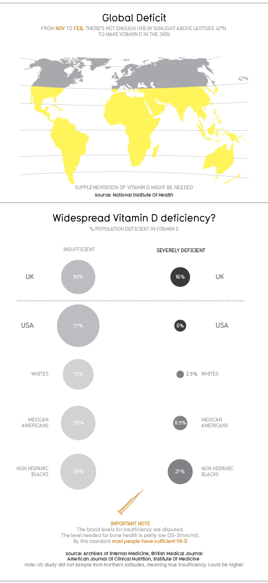
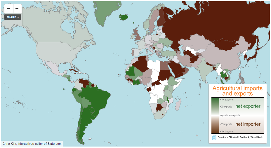
Some countries are net exporters of food (their food exports are larger than their food imports) while others are net importers of food (their food imports are larger than their food exports).

Among the net exporters of food we find the majority of South American countries, with the exception of Venezuela and Suriname, the United States, Canada, Mauritania, Indonesia, Australia, and a few African countries such as Mauritania, Ivory Coast and Ghana. The largest net exporter of food, by far, is Argentina with $23.42 of food exports per every $1.00 of food imports. Argentina is followed by Brazil, New Zealand, Paraguay and Iceland.

Among the net importers of food we find countries such as Russia, Finland, Sweden, the UK, Italy, Germany, Portugal, Sudan, Cuba, Saudi Arabia, Japan, etc. The largest net food importer is Eritrea, with $0.01 of food exports per every $1.00 of food imports. Eritrea is closely followed by Venezuela, Turkmenistan, and Algeria.

Data for for both agricultural exports and imports are for 2010.

Source: Slate.com: Maps: Agriculture in the U.S. and Around the World
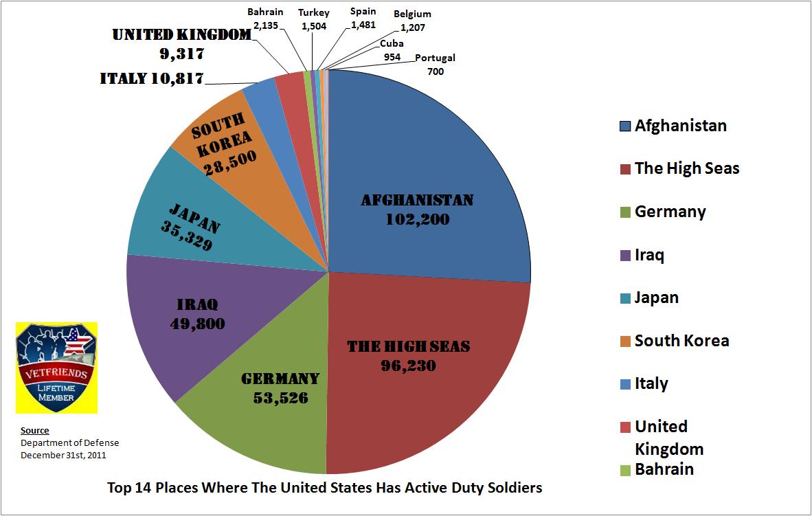
 

Education Expenditure vs. Military Expenditure

This visualization by the Deutsche Welle, shows how much is spent in education versus how much is spent in the military, as a percentage of the GDP, worldwide.

The dividing line denotes equal expenditure in both education and the military. Most countries seem to be concentrated on the left side of the line, meaning they spend more in education than in defense. Countries in this group include the United States, Iran, Portugal, Italy, Germany, Canada, etc. The country that immediately grabs our attention is Cuba, showing the highest expenditure in education (about 13% of its GDP) relative to its expenditure in defense (about 4% of its GDP). Lesotho follows Cuba very closely.

On the right side of the dividing line, we have the nations spending more on the military relative to education spending. Countries in this group include: Somalia, Sudan, Syria, Israel, etc. It is worth noting that Oman shows the highest expenditure in defense (close to 12% of its GDP) relative to its expenditure in education (about 4% of its GDP). Saudi Arabia and Qatar follow Oman closely.

For more visualizations of education indicators worldwide, visit: Deutsche Welle: In Numbers: Education Around the World


Sweet Deal: The Global Trade of Chocolate

click to enlarge

This visualization by The Guardian, actually made out of real chocolate, depicts the world trade (exports and imports) of chocolate. Between 2010 and 2011, 4.24 million tons of cocoa beans were processed worldwide.

The top cocoa bean producers are: Ivory Coast, Ghana, Indonesia, Nigeria, Cameroon, Brazil, and Ecuador, among others. The top importers include: Netherlands, the United States, Germany, Malaysia, Belgium, France, the UK, and Spain.

For a list of the top global confectionery companies, visit: International Cocoa Organization: The Chocolate Industry