Monthly Archives: July 2013

Deaths from Organized Internal Conflict

deaths from organized internal conflict
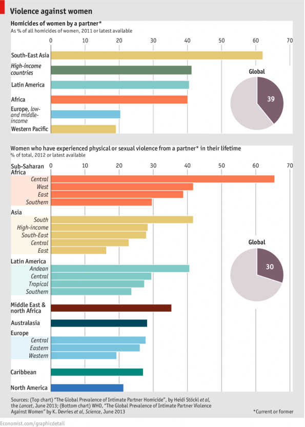
The number of deaths as a result of internal armed conflicts has increased dramatically from 37,300 back in 2007 to 178,300 in 2012. Internal conflict is defined as armed conflict between two parties, one of which is the government of that country.

For 2012, the largest number of deaths have occurred in Syria (40.9%), Libya (17.3%), Mexico (14.2%), and Pakistan (5.2%). The areas of major conflict have switched from Iraq and Afghanistan back in 2007 to Syria and Libya in 2012.

Source: The Economist: Syria v Libya v Iraq – A numerical evaluation of recent conflict


Stock Performance of Selected Internet Companies in 2013

stock performance of selected internet comanies 2013The year 2013 has been a good year, so far, for selected internet companies. In this chart by Statista we can see the percentage change since January 2013 to July 12, 2013 for the stock performance of companies like Yahoo, Google, Amazon, etc.

The best performer has been LinkedIn with a 77.5 percentage change since January 2013. LinkedIn is followed by Yahoo, Google, AOL, Amazon, and eBay. Facebook, on the other hand, has seen a decline in its stock performance in the same period of time.


Oil Production and Consumption by Country

oil production and consumption since 1965When it comes to oil production and consumption, countries have a very close relationship of interdependence with each other. Some countries consume more oil than what they produce relying on imports to satisfy their internal demand. Others, consume less than what they produce, being able to export oil to nations that need it.

Oil consumption (yellow) for the United States, for example, was larger than its production (grey) for 2012, 18.55 mb/d (million barrels per day) compared to 8.9 mb/d, importing more than double its production to satisfy the gap in internal demand. Other nations with oil consumption higher that oil production include China, Brazil, Australia, India, UK, and Indonesia.

In contrast, oil consumption for Saudi Arabia for 2012 is estimated at 2.94 mb/d, while its production reached 11.53 md/d, exporting its oil surplus to the rest of the world. Other nations whose oil production exceeds its oil consumption include Canada, Mexico, Venezuela, Norway, Russia, Kuwait, United Arab Emirates, and Qatar.

Source: Winston Smith Labs: Global Oil Production and Consumption since 1965 [Interactive Map/Graph]


The Quality of Democracy by Country

democracy ranking worldmap 2012Global Democracy Ranking released the Democracy Ranking for the year 2012, which shows the quality of democracy around the world.

Several indicators were used to calculate the Global Democracy Ranking. Those indicators were selected from a vast variety of dimensions such as politics, economy, environment, gender equality, education, health, and knowledge.

As seen in the map above, countries ranked at the top (dark green), those with the highest quality of democracy include Norway, Sweden, Finland, Switzerland, Denmark, Netherlands, New Zealand, Germany, Ireland, and Austria. In contrast, we find countries where democracy is at serious risk or where it is no longer a viable system (brown). Among these countries we have Yemen, Syria, Libya, Togo, Guinea-Bissau, China, Pakistan, Egypt, Nigeria, and Haiti.

Source: Global Democracy Ranking: Democracy Ranking 2012


U.S. Mobile Phone Subscribers Talk the Most

americans and the mobile phoneOn average, U.S. mobile subscribers talk on the phone 356 minutes, or roughly 6 hours per month. That number is double that of the Turkey, and 4.5 times that of Germany. That estimate is the highest among selected OECD countries.

Canadians are not far behind. The outgoing traffic per mobile subscriber is an average 345 minutes (5 hours and 45 minutes) in a single month.

 Source: Statista: Americans Talk on Their Mobile Phones More Than Anyone Else


Worldwide Remittance Flows

world remittance flows 2012Remittances, or money sent by migrant workers to their home countries, have increased since the year 2000. Although, they temporarily decreased after the economic crisis back in 2008, they recovered in 2010 and continued to rise. Remittances increased from $204 billion back in 2000 to $540 billion in 2012.

Countries with the highest remittance inflows include India ($71 billion), China ($62 billion), Mexico, the Philippines, Nigeria, Egypt, and France. Only nine countries saw a reduction in remittance inflows, among them Greece and Turkey which experienced the steepest decline.

For the interactive map, please visit: Tages Woche: The incredible rise of migrants’ remittances


Basic Salary of Lawmakers by Country

basic salary of lawmakers by country 2013How much lawmakers are paid is a sensitive issue especially in times of economic austerity, or in countries where the majority of the population lives in extreme poverty conditions.

In this chart prepared by The Economist, we can see how much lawmakers are being paid in different countries across the globe in U.S. dollars (left), and as a ratio of the gross domestic product (GDP) per capita (right).

In Nigeria, for example, lawmakers receive a basic salary of $189,000, 116 times the country’s GDP per capita. In Kenya a lawmaker makes a basic salary of $74,500, 76 times the country’s GDP per capita. Other countries were lawmakers receive the heftiest salaries include Ghana, Indonesia, South Africa, Brazil, Thailand, and India. It is worth pointing out that most of these countries are some of the poorest in the world.

In comparison, in the wealthiest nations a lawmaker’s salary as a ratio of GDP is much smaller. In Britain, that ratio is 2.7 of the GDP per capita.


The Failed States Index 2013

failed state index 2013Fund For Peace just released the Failed State Index (FSI) 2013. The FSI measures the level of risk in each country using a series of risk indicators such as mounting demographic pressures, massive movement of refugees, uneven economic development, poverty, legitimacy of the state, progressive deterioration of human services, violation of human rights, violation of the rule of law, security apparatus, intervention of external actors, etc. The FSI is calculated for a total of 178 countries.

Nations ranking at the top for failed states (red) include Somalia, Congo, Sudan, and South Sudan. Unfortunately, most of the world’s nations seem to be under a warning (orange) for failed states, from Africa to Asia to Latin America.

For the complete list of countries, rankings and scores, please visit: Fund For Peace: Failed State Index (FSI) 2013


Violence Against Women by World Region

violence against womenIn this chart published by The Economist we look at two sets of data about violence against women.

The first one shows that more than a third (39%) of homicides of women around the world are committed by a previous or current partner. The numbers are specially shocking for South East Asia (Cambodia, Laos, Myanmar [Burma], Thailand, Vietnam, Brunei, Malaysia, East Timor, Indonesia, Philippines, and Singapore). The numbers are also high for Latin American and African countries.

The second set of data shows that 30% of women around the world have experienced physical or sexual violence during their lifetime by a former or current partner. The numbers are the highest for Central African countries (Burundi, Central African Republic, Democratic Republic of the Congo, and Rwanda),  followed by countries in West Africa (Benin, Burkina Faso, Ivory Coast, Ghana, Liberia, Nigeria, Senegal, Sierra Leone, etc.), South Asia (Afghanistan, Bangladesh, Bhutan, India, Maldives, Nepal, Pakistan, and Sri Lanka), the Andean region of South America (Colombia, Venezuela, Ecuador, Peru, and Bolivia), the Middle East, and North Africa.


World Population Growth Over Time

population growth over time 1800-2050

World population growth accelerated in the last century. During the twentieth century alone, the number of people increased from 1.5 billion to 6 billion.

In the year 1800 the world’s population had reached 1 billion, with most people living in Asia and Europe. By 1927, 127 years later, the population of the world had doubled, reaching an staggering 2 billion people.

population growth over time 1927Population growth remained almost the same until 1950 when advances in science and medicine increased life expectancy, specially in developed nations.

The world’s population reached 3 billion inhabitants by 1960, 4 billion by 1974, 5 billion by 1987, 6 billion by 1999, 7 billion by 2011.

population growth over time 2050It is estimated that the population of the world will reach 8 billion by 2024, and 9 billion by 2050. Most of the growth will occur in developing nations

Source: NOVA: Human Numbers Through Time