Monthly Archives: March 2013

The World as 100 People

In this interesting infographic, created by Jack Hagley, we take a look at the world as if the total population of the world was 100 people. The information presented covers topics such as the distribution of gender, information, spoken languages, literacy, religion, age, housing, water, nutrition, and population inhabiting each continent.


Major Causes of Death in the 20th Century

This visualization by Information is Beautiful shows the major causes of death for the 20th century.

According to the data in this graphic, the most common causes of death were non-communicable diseases (excluding cancer) such as cardiovascular diseases, diabetes, respiratory diseases, neuro-mental illness, and digestive illness; infectious diseases such as smallpox, diarrhea, malaria, tuberculosis, and respiratory diseases; death caused by humans such as murder, war, suicides, air pollution, drugs, and accidents; health complications, and cancer.


Drone Attacks Visualized

click to enlarge

The use of drones to eliminate enemy targets has become routine practice for U.S. military operations since 2004, specially in Afghanistan and Pakistan.

Pitch Interactive has created the visualization above, showing the number of drone attacks since 2004 to date, as well as the number of casualties. Of an estimated 3,105 casualties, 175 were children (5.6%), 535 were civilians (17.2%), and 2,348 (75.6%) were casualties classified as other, which can include male able-bodied enemy combatants, their neighbors, and possible militants.

Data for this visualization was obtained by Pitch Interactive from the Bureau of Investigative Journalism,  the New America Foundation, and Living Under Drones.


Government Debt as a Percentage of GDP

Government Debt as a Percentage of GDP

Using data from Eurostat, we identified the top 10 European countries with the highest government debt as a percentage of GDP. The chart above shows that as of the third quarter of 2012, the latest period for which quarterly data is available, Greece, Italy, and Portugal had the highest government debt ratio. Ireland was close behind Portugal, with a ratio that has been increasing at the fastest rate out of all the countries in the list. Cyprus, which has been in the news lately due to problems in its banking sector, had a debt ratio not much higher than Germany.

Source: Eurostat

Political Violence Risk by Country

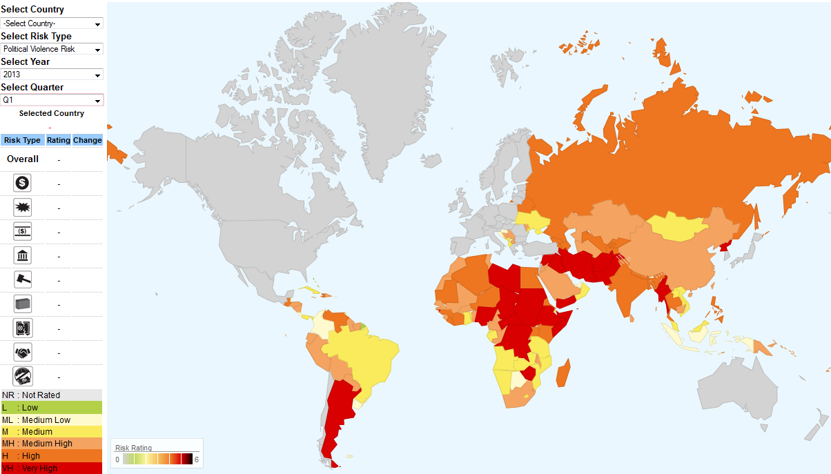
This map created by Aon Risk Solutions, as part of its Crisis Management Web Analytics tool, shows which countries are at risk of facing political violence.

Political violence risks include terrorism, strikes, riots, civil upheaval, sabotage, war, civil war, rebellion, revolution, insurrection, a hostile act by a belligerent power, mutiny or a coup d’etat.

Based on a rating from 0 to 6, 0 being low risk (green), and 6 being very high risk (red), we can see that the countries that carry the highest risk of political violence include Argentina in the Americas; Chad, Nigeria, Sudan, Ethiopia, Somalia, Central African Republic, Democratic Republic of Congo, and Zimbabwe in Africa; Yemen, Iran, Iraq, Afghanistan, Pakistan, Syria, Myanmar, and North Korea in Asia. OECD countries are not rated in this map.

For more detailed information visit:
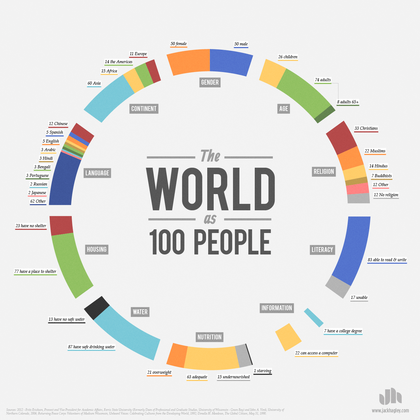
 

Water Available Per Person Worldwide

click to enlarge

March 22, 2013 has been designated World Water Day by the United Nations. In that regard, we wanted to see how much water is available per person per day across the planet.

The map above, winner of the Urban Water Design Challenge for Interactive Water Footprint Infographic at Harvard University, shows how much water is available for each person in a single day in each country.

Countries with the largest amount of water available per person per day (dark areas) include: the United States (4,382 litters/day), Canada (3,796 litters/day), and Ecuador (,3516 litters/day) in the Americas; Hungary (5,704 litters/day) in Europe; Azerbaijan (5,619 litters/day), Iraq (4,060 litters/day), and Tajikistan (5,033 litters/day) in Asia; Sudan (2,822 litters/day), and Egypt (2,527 litters/day) in Africa.

For the interactive infographic and other interesting visualizations about water, please visit: Circle of Blue: Harvard Students Win Urban Water Design Challenge for Interactive Water Footprint Infographic 

Forest Areas as a Percentage of Land Area Worldwide

March 21, 2013 has been declared the first International Forest Day by the United Nations. In that light, we decided to take a look at one key environmental indicator that measures the percentage of forest area present in different regions of the planet.

The map above, created by the World Bank depicts forest areas as a percentage of land area for each country. Forest area is defined as land, natural or planted, under groves of trees of at least 5 meters (productive or not), excluding tree groves in agricultural production systems.

Countries with the highest forest area as a percentage of land area (dark red areas) include: Guyana, Suriname, and Belize in the Americas; Finland and Sweden in Europe; Bhutan, Laos, Japan, South and North Korea in Asia; Guinea, Gabon, Democratic Republic of Congo, Congo, and Guinea Bissau in Africa; Papua New Guinea in Oceania.


Health Insurance Rates by County for the U.S.

This map from The Daily Biz, created using data from the U.S. Census Bureau, shows health insurance rates by county for people under the age of 65 across the United States.

Darker areas represent the counties with higher rates of uninsured Americans, while lighter areas represent the counties with lower rates of uninsured people under age 65.

The higher rates of uninsured Americans can be found concentrated in the Western and Southwestern estates, and in some parts of the Southeast. By contrast, the rate of uninsured Americans is lower in the Northeast and parts of the Southeast and Midwest.


How Welcome Are Foreign Visitors in Your Country?

When traveling around the world, tourists do not know which countries will welcome them, and which countries won’t.

A recent report on world tourism by the World Economic Forum fills that void. The report compiled a list of the most and least friendly countries for tourists. Using a scale from 1 to 7, where 1 stands for the unfriendliest countries, and 7 stands for the friendliest nations, the report ranks countries according to the attitude of the population toward foreign visitors.

As seen in the map above, among the unfriendliest nations we find Bolivia, Venezuela, Russia, Kuwait, Latvia, Iran, Pakistan, Slovakia, Bulgaria and Mongolia. Among the friendliest nations we find Iceland, New Zealand, Morocco, Macedonia, Austria, Senegal, Portugal, Bosnia and Herzegovina, Ireland, and Burkina Faso.

Resource:  World Economic Forum: The Travel & Tourism Competitiveness Report 2013


Food Spending by Country

Food spending by country

The share of household spending devoted to food and drink varies widely by country, as shown in the chart above recently published by The Economist using data from the US Department of Agriculture. The chart shows that Americans spend less than 10% of their income on food and drink, whereas people in Cameroon spend close to 50%. What percentage of your income pays for food and drink?