Tag Archives: health

How Americans Spent Money in 2012


how americans spend money

Housing, food, transportation, and clothing account for an estimated 66% of income spent for an average American household in 2012.

According to The Atlantic, housing, food and clothing account for more than 60% of expenses for the poor. Basically, most of their income is spent is covering basic needs and not much, or none, is left for savings. The rich, by contrast, have a larger margin that can be spent in entertainment, insurance, and savings.

Source: The Atlantic: Where Americans—Rich and Poor—Spent Every Dollar in 2012


Deaths by Hepatitis vs. Deaths by HIV by Country

hepatitis and hiv world HIV killed 1.47 million people in 2010. Viral hepatitis killed as many as 1.44 million people in the same year. Even though the number of deaths caused by viral hepatitis follows close that of HIV, its impact goes largely ignored worldwide.

According to The Economist, viral hepatitis killed more people in 117 out of 187 countries, including China, India, Japan, and the UK. In the map above, countries in dark red show a higher ratio of deaths by viral hepatitis to deaths caused by HIV. Those countries include Egypt, Mongolia, UK, Turkey, Yemen, Iraq, South and North Korea, Japan, Finland, Sweden, Poland, and Germany.

Source: The Economist: The other killer – Hepatitis kills more people than HIV in most countries


Body Mass Index (BMI) by Country

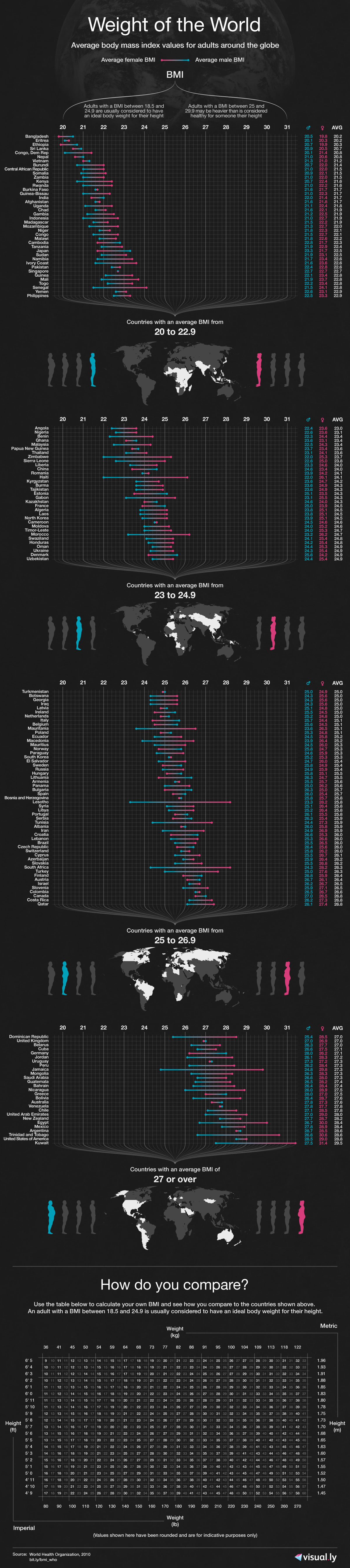
A body mass index (BMI) between 18.5 and 24.9 is usually considered a healthy body weight to height relationship. A BMI of 25 or higher indicates body weight not optimal for the height of a particular person.

This visualization published by Visual.ly, shows the different BMI values for adult men and women across the globe.

Countries with a healthy average BMI between 20 and 22.9 include several nations in Africa, Yemen, India, Thailand, Japan, Pakistan, Singapore, among others.

Countries with an average BMI between 23 and 24.9 include several Asian nations, several European nations (including France), some nations in Africa, and Honduras.

Countries with an average BMI between 25 and 26.9 include Canada, Russia, Costa Rica, Colombia, Israel, Austria, Switzerland, Brazil, all Nordic countries, Spain, Portugal, and nations in the Middle East.

Countries with an average BMI of 27 and over  (the highest BMI range) include the United States, Kuwait, Cuba, Argentina, Chile, Bolivia, Peru, Venezuela, Australia, UK, New Zealand, Greece, and Germany to name a few.


Cancer Death Rates for Men and Women

Cancer affects both women and men globally. However, cancer death rates are different for each gender, as can be seen in the two maps displayed in this article.

We find the highest cancer death rates for women (126 or more per 100,000 population) in Mongolia, Denmark, Albania, Macedonia, Uganda, and Honduras.

The cancer death rate for men is the highest (150 per 100,000 people) in most parts of the world, compared to women. Countries with high death rates for males include most European countries, Middle Eastern nations, Russia, Mongolia, Kazakhstan, China, Japan, South and North Korea, Turkey, South Africa, Argentina, Uruguay, and Cuba. Other countries with high death rates for males (126 or above per 100,000 people) include the United States, Canada, Brazil, and Australia.

We can only speculate about the factor behind this disparity in numbers of cancer death rates for men and women worldwide.

For detailed information, please visit:


Global Vitamin D Deficit

According to a 2010 infographic by Information is Beautiful, people inhabiting in the Northern hemisphere, more precisely above latitude 42°N, are not getting enough UVB light from sunlight to make vitamin D in the skin during winter season.

In the UK, 50% of the population has insufficient levels of vitamin D, while 16% of the population is severely deficient. In the United States, 77% of the population has insufficient levels of vitamin D, while 6% of the population is severely deficient. Within the U.S., the groups more affected by insufficient levels of vitamin D are Non-Hispanic blacks (98%) and Mexican Americans (90%).

To try compensate for the lack of UVB light in winter time and the consequent low vitamin D levels, consumers have turned to the vitamin D industry, an industry that is worth $460 million, as of 2009, in the U.S. alone.

For more graphics and statistics, visit: Information is Beautiful: Vitamin D

It Is Flu Time!

Right now it is flu season in the northern hemisphere. The flu (influenza) is a contagious respiratory disease caused by influenza viruses.

Google Trends created the map shown above, based on aggregate data generated by users searching for the word “flu” and related terms, in order to estimate flu activity worldwide. According to data captured by Google Trends, flu activity is very intense in the U.S. at the moment. Canada, Russia, Norway, Poland, the Netherlands and Japan show high flu activity as well.


The Centers for Disease Control and Prevention (CDC) tracks the geographical spread of flu across the United States, however, the collected data does not reflect intensity of influenza activity.

As can be seen in the map, the flu has spread relatively quickly in the last three weeks throughout the continental United States. California, Mississippi and the District of Columbia show local influenza activity at the moment.


Malaria Around the World

click to enlarge

Malaria, a mosquito-borne infectious disease, affects 100 countries worldwide. It is mostly present in semi-tropical and tropical poor areas of Africa, South and Central America, and Asia. Of the 100 affected countries, 35 are located in Africa. Africa is the region most affected because its hot and humid weather makes transmission possible all year round. Lack of resources makes prevention and control of the disease very difficult. 89% of the malaria deaths worldwide occur in Africa.

Related Links:


Do You Live in a “Healthy” State?

According to data from the Center for Disease Control and Prevention (CDC), most states have become healthier in terms of physical activity for the years between 2001 and 2007, excluding Louisiana and Mississippi which have less than 40% of healthy residents.

The CDC defines as “healthy people” those who engage in moderate-intensity physical activity at least 5 days a week for 30 minutes a day, or those who engage in vigorous-intensity physical activity at least 3 days a week for 20 minutes a day.

It is interesting to note, though, that data displayed on these maps tells a different story than data for the obesity rate in the United States. As we showed on a previous post, the obesity rate in the U.S. has been rising steadily since at least 1991. There is a clear contradiction between the rise in obesity rates and the rise in the percentage of healthy people.


Interesting Links of the Day – July 16, 2012

  1. Health information systems in developing countries: Star Wars or reality? Patricio Marquez (World Bank)
  2. IMF slashes UK economic growth forecast – Phillip Inman (The Guardian)
  3. GOLDMAN SACHS: This Is What The Country’s Biggest Housing Markets Will Do For The Next 2 Years – Ben Duronio (Business Insider)