Category Archives: Population

The United States vs. China

US and China compared - final graphic
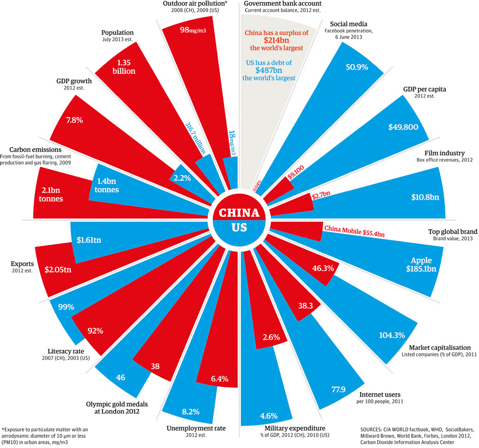
The Guardian created this comparison of the U.S. and China, comparing several indicators such as GDP growth, GDP per capita, carbon emissions, exports, literacy rate, unemployment rate, military expenditure, outdoor pollution, to name a few.

The US is ahead of China in terms of literacy rate, number of internet users, military expenditure as a percentage of GDP, unemployment rate, GDP per capita, market capitalization, and social media. On the other hand, China is ahead of the U.S.  in terms of exports, GDP growth, number of people, carbon emission, and outdoor pollution.

While the U.S. has the largest deficit in its current account, China has the largest surplus.

Cervical Cancer and the HPV Vaccine in Developing Countries

HPV vaccine infographicAn estimated 275,000 women die of cervical cancer every year, with the majority of these deaths occurring in developing nations. Those deaths could be easily avoided by vaccinating women with the HPV vaccine.

Due to the high cost of the HPV vaccine, $100 per dose in developed nations, many women and girls in poor countries did not have access to it. Thanks to the GAVI Alliance, a partnership funded by governments as well as by corporate and private partners, this vaccine will be available in developing nations at a cost of $4.50 per dose. African countries soon beginning vaccination include Kenya, Ghana, Lao PDR, Madagascar, Malawi, Niger, Sierra Leone, and Tanzania.

Source: GAVI Alliance: Millions of girls in developing countries to be protected against cervical cancer thanks to new HPV vaccine deals


The Most and Least Racially Tolerant Countries

racial-tolerance-mapA survey conducted by two Swedish economists asked respondents in 80 countries what kind of people they would not like as neighbors, to which many replied “people of a different race”.

The results from that survey are displayed in this map published by the Washington Post. According to the survey, people in English-speaking, Scandinavian, and Latin American countries are the most racially tolerant, with the exception of Venezuela. South Africa shows to be a tolerant country, while the attitudes in Europe show a lot of variation. People in countries such as France, Turkey, India, Jordan, Saudi Arabia, Egypt, Nigeria, South Korea, and Indonesia are the least racially tolerant.


Percentage of the Population Living on $2 or Less a Day

surviving on a few dollars per day worldMIT economists Abhijit V. Banerjee and Esther Duflo, conducted surveys in developing nations to see which countries survive on a few dollars per day. The cities or countries where people are known to live on meager dollar amounts on a daily bases are not that surprising, but the percentage of the population living under these conditions is.

In Udaipur and Hyderabad (India) a staggering 94% of the population survive on $2 or less per day. In Bangladesh, 69.4% go on $2 or less per day. In Ghana, 67.7% survive on $2 or less per day. In Guatemala, 64.8% of the population survive on $2 or less per day.

Source: GOOD: Living on Less


Women in the Workforce by Country

women and equality worldIt has been said, that if women participated in the workforce more actively, like their male counterparts, the Gross Domestic Product (GDP) of those countries would be higher.

However, most countries, including some developed nations do not have policies in place that support women’s participation in the workforce, such as access to education, credit, employment, paid maternity leave or child care.

Countries with the highest economic success for women (measured in terms of equality of pay, degree of inclusion in the workforce, and career advancement), that offer the best policies for supporting women in the workforce include Norway, Australia, Sweden, Finland, Germany, Belgium, and Iceland.

Countries with the lowest degree of economic success that have few policies (or none) that support women in the workplace include Chad, Sudan, Yemen, Pakistan, Syria, Saudi Arabia, among others.

women and equality world 2Some interesting facts about the success of women in the workplace and the policies in place to support them in certain countries can be seen in the graphic above.

Source: Harvard Business Review: Vision Statement: Women and the Economics of Equality


Internet Connectivity in the United States

As part of the PBS series America Revealed, this aerial visualization shows the patterns of internet distribution in the United States. We can see that the regions with highest levels of internet connectivity include the Northeast, and parts of the South and Midwest, followed by the Pacific West.

For additional interesting aerial visualizations, such as the distribution of the unemployed, electricity network routes, public transportation paths, U.S. imports and exports of beef patterns, the distribution of the population in towns and cities, etc., visit: The Roosevelt’s – Aerial Data Visualisation Reveals Life In The United States.

The Influenza Virus Visualized

Humans can be infected by influenza viruses types A,B, and C. Type A affects humans, birds, and pigs. Type B and C affect only humans. Type C is less severe than type A and it does not cause pandemics.

In this visualization by Information is Beautiful, we can see how the different strains of influenza virus affect humans, what is their origin, and how they are transmitted from pigs and from birds ultimately to humans.

Type A influenza is divided into H and N strains. The “swine flu” N1H1 killed 15,000 people worldwide in 2009-2010. The “bird flu” H5N1 strain, with a fatality rate of 60%, has killed 371 people as of 2013. The more recent H7N9 strain has killed thousand of pigs in China, with 8 human fatalities to date.


North Korea vs. South Korea

In this visualization created by The Guardian, we can see how North Korea compares to South Korea in terms of population, Gross Domestic Product (GDP), life expectancy, freedom of the press, military spending, internet connectivity, infant mortality, among other indicators.

North Korea is a poor country with half the population of South Korea. It is one of the worst countries in terms of corruption and freedom of the press. Its military spending constitutes approximately 22.3% of its GDP, compared to 2.8% for South Korea.

Additional resource: IndexMundi: South Korea vs. North Korea – Country Comparisons


Life Expectancy at Birth for Women

Life expectancy at birth, for women, varies significantly across the world.

On one side of the spectrum, we find nations where the life expectancy at birth for females is 80.5 years or more. Countries in this group include the United States, Canada, Chile, several developed nations in Northern, Southern and Eastern Europe, Australia, New Zealand, Japan, and South Korea.

On the other side, we find nations where the life expectancy at birth for females is much lower, 62.0 years or less. This group is comprised by the majority of African countries, with the exception of North African nations, and Afghanistan.

Resource: The World Bank DataBank: Gender Statistics – Life expectancy at birth, female (years)


Mortality Numbers for Children Under Five

In 2011, 6.9 million children under five years old died around the globe from different causes ranging from pneumonia, malaria, diarrhea, HIV/AIDS, meningitis, to all kinds of injuries.

The number of deaths of children under five has decreased by 59% in the last forty years, from 16.9 million back in 1970 to 6.9 million in 2011. That is good news for the world in general; however, there are still regions in the planet where under-five mortality rates have changed hardly at all. That is the case of Africa, where countries with the highest under-five mortality rates include Sierra Leone, Somalia, Mali, Chad, Democratic Republic of the Congo, Central African Republic, Guinea-Bissau, and Angola. In other parts of the world, countries with high under-five mortality rates include Afghanistan, India, Pakistan, Papua New Guinea, Haiti and Bolivia.

Income is a critical factor influencing under-five mortality rates, as shown in the graph above. The larger the income per capita of a nation, the lower the mortality rate. Such is the case of developed economies like Luxembourg or Norway, in stark contrast with developing countries like Somalia or Sierra Leone, where income per capita is very low.

Source: Health Intelligence: Under-five Mortality dashboard