Category Archives: Topics

Internet Connectivity in the United States

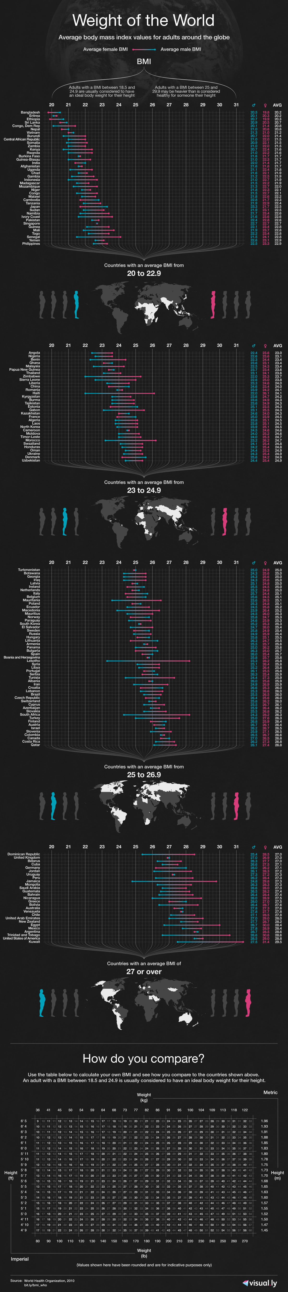
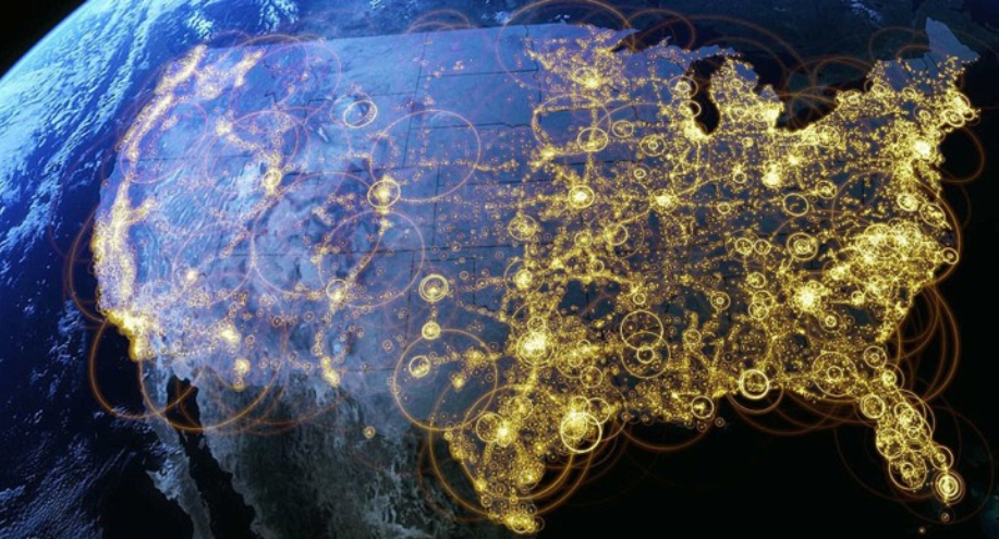
As part of the PBS series America Revealed, this aerial visualization shows the patterns of internet distribution in the United States. We can see that the regions with highest levels of internet connectivity include the Northeast, and parts of the South and Midwest, followed by the Pacific West.

For additional interesting aerial visualizations, such as the distribution of the unemployed, electricity network routes, public transportation paths, U.S. imports and exports of beef patterns, the distribution of the population in towns and cities, etc., visit: The Roosevelt’s – Aerial Data Visualisation Reveals Life In The United States.

Body Mass Index (BMI) by Country

A body mass index (BMI) between 18.5 and 24.9 is usually considered a healthy body weight to height relationship. A BMI of 25 or higher indicates body weight not optimal for the height of a particular person.

This visualization published by Visual.ly, shows the different BMI values for adult men and women across the globe.

Countries with a healthy average BMI between 20 and 22.9 include several nations in Africa, Yemen, India, Thailand, Japan, Pakistan, Singapore, among others.

Countries with an average BMI between 23 and 24.9 include several Asian nations, several European nations (including France), some nations in Africa, and Honduras.

Countries with an average BMI between 25 and 26.9 include Canada, Russia, Costa Rica, Colombia, Israel, Austria, Switzerland, Brazil, all Nordic countries, Spain, Portugal, and nations in the Middle East.

Countries with an average BMI of 27 and over  (the highest BMI range) include the United States, Kuwait, Cuba, Argentina, Chile, Bolivia, Peru, Venezuela, Australia, UK, New Zealand, Greece, and Germany to name a few.


The Influenza Virus Visualized

Humans can be infected by influenza viruses types A,B, and C. Type A affects humans, birds, and pigs. Type B and C affect only humans. Type C is less severe than type A and it does not cause pandemics.

In this visualization by Information is Beautiful, we can see how the different strains of influenza virus affect humans, what is their origin, and how they are transmitted from pigs and from birds ultimately to humans.

Type A influenza is divided into H and N strains. The “swine flu” N1H1 killed 15,000 people worldwide in 2009-2010. The “bird flu” H5N1 strain, with a fatality rate of 60%, has killed 371 people as of 2013. The more recent H7N9 strain has killed thousand of pigs in China, with 8 human fatalities to date.


North Korea vs. South Korea

In this visualization created by The Guardian, we can see how North Korea compares to South Korea in terms of population, Gross Domestic Product (GDP), life expectancy, freedom of the press, military spending, internet connectivity, infant mortality, among other indicators.

North Korea is a poor country with half the population of South Korea. It is one of the worst countries in terms of corruption and freedom of the press. Its military spending constitutes approximately 22.3% of its GDP, compared to 2.8% for South Korea.

Additional resource: IndexMundi: South Korea vs. North Korea – Country Comparisons


Human Development Index 2012

The Human Development Index (HDI) is a composite measure that includes three indicators: life expectancy at birth, level of education attained, and income. The HDI is an alternative to the purely economical GDP, that quantifies economic growth only. Thus, the HDI provide a way to gauge the development of a country. The HDI for 2012 includes 187 countries.

The HDI ranks countries according to their degree of development using a scale from 0 to1, 0 being the least developed and 1 being the most developed country.

In the HDI map above, published by the Brazilian media site Globo.com we find that Norway has a score of 0.955, ranking number one as the most developed country (color green). Norway is followed by Australia, the U.S., the Netherlands, Germany, New Zealand, among others.

At the other end of the spectrum we find the least developed nations (color purple), including the majority of African nations, Pakistan, Afghanistan, Myanmar, Bangladesh, Nepal, and Papua New Guinea.


Industrial Water Consumption by Country

Across the globe, freshwater is consumed by four different economic sectors: domestic, industry, energy and agriculture. The agricultural sector is the largest consumer of water. The industrial and energy sectors follow suit, using 20% of available water resources.

This map (above), published by the Sustainable Sanitation and Water Management Toolbox, shows how much water is used by the industrial sector by each country. For the year 2009, the largest consumers of water for industrial use were the U.S. and Europe. Water consumption by the industrial sector accounted for 50% of total water use.


Billionaires and their Wealth by Country

This map of the world’s wealthiest citizens was created by Forbes. A total of 1,426 billionaires were found across the globe, worth $5.4 trillion combined.

The wealth of billionaires in the U.S. alone, 1,872.5 trillion, is larger than the combined wealth of billionaires in each continent. The wealth of the world’s richest in the Americas is an outstanding $2.4 trillion thanks to the contributions of billionaires mainly from the U.S., Brazil, Mexico, Canada, Chile, Colombia, Peru, and Venezuela.

The Americas are followed by Europe, where the wealth of its billionaires combined is valued at $1.55 trillion. Europe is followed by Asia with the wealth of its billionaires estimated at $1.16 trillion. Africa and the Middle East come at last, where the total net worth of its richest citizens is valued at $279 billion.


Map of Internet Activity

click here to see the animation

Someone hacked thousands of computers all around the world in order to create a map of internet activity in the course of a day.

In this map from FastCo.Design, the red dots show peak internet activity around the world at different times of the day, while the blue dots show base traffic. Some interesting conclusions point to the fact that nighttime affects the U.S. and Europe very little, due to the fact that permanent internet connectivity is available.

The World as 100 People

In this interesting infographic, created by Jack Hagley, we take a look at the world as if the total population of the world was 100 people. The information presented covers topics such as the distribution of gender, information, spoken languages, literacy, religion, age, housing, water, nutrition, and population inhabiting each continent.


Major Causes of Death in the 20th Century

This visualization by Information is Beautiful shows the major causes of death for the 20th century.

According to the data in this graphic, the most common causes of death were non-communicable diseases (excluding cancer) such as cardiovascular diseases, diabetes, respiratory diseases, neuro-mental illness, and digestive illness; infectious diseases such as smallpox, diarrhea, malaria, tuberculosis, and respiratory diseases; death caused by humans such as murder, war, suicides, air pollution, drugs, and accidents; health complications, and cancer.