Category Archives: Maps

Human Development Index 2012

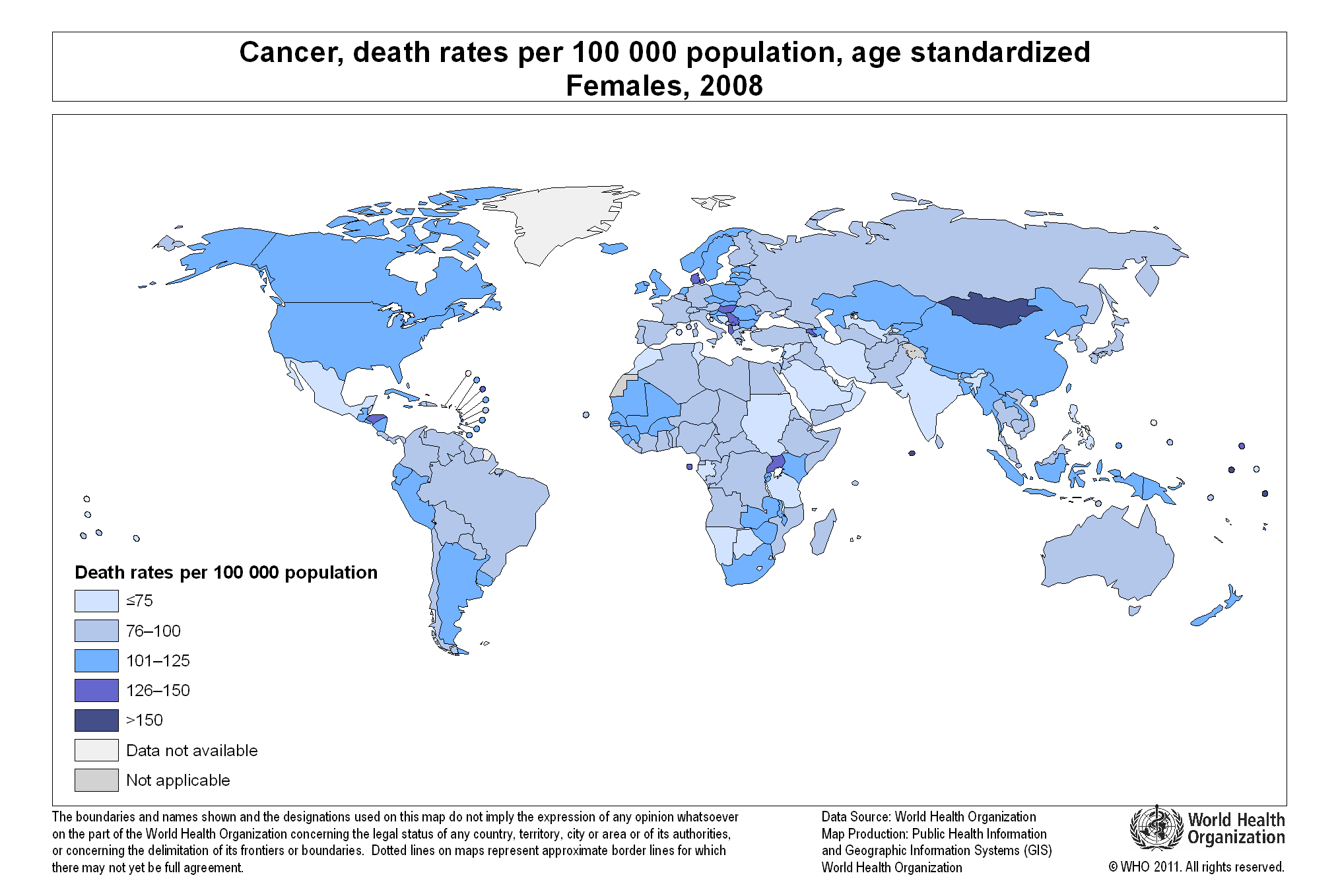
The Human Development Index (HDI) is a composite measure that includes three indicators: life expectancy at birth, level of education attained, and income. The HDI is an alternative to the purely economical GDP, that quantifies economic growth only. Thus, the HDI provide a way to gauge the development of a country. The HDI for 2012 includes 187 countries.

The HDI ranks countries according to their degree of development using a scale from 0 to1, 0 being the least developed and 1 being the most developed country.

In the HDI map above, published by the Brazilian media site Globo.com we find that Norway has a score of 0.955, ranking number one as the most developed country (color green). Norway is followed by Australia, the U.S., the Netherlands, Germany, New Zealand, among others.

At the other end of the spectrum we find the least developed nations (color purple), including the majority of African nations, Pakistan, Afghanistan, Myanmar, Bangladesh, Nepal, and Papua New Guinea.


Billionaires and their Wealth by Country

This map of the world’s wealthiest citizens was created by Forbes. A total of 1,426 billionaires were found across the globe, worth $5.4 trillion combined.

The wealth of billionaires in the U.S. alone, 1,872.5 trillion, is larger than the combined wealth of billionaires in each continent. The wealth of the world’s richest in the Americas is an outstanding $2.4 trillion thanks to the contributions of billionaires mainly from the U.S., Brazil, Mexico, Canada, Chile, Colombia, Peru, and Venezuela.

The Americas are followed by Europe, where the wealth of its billionaires combined is valued at $1.55 trillion. Europe is followed by Asia with the wealth of its billionaires estimated at $1.16 trillion. Africa and the Middle East come at last, where the total net worth of its richest citizens is valued at $279 billion.


Map of Internet Activity

click here to see the animation

Someone hacked thousands of computers all around the world in order to create a map of internet activity in the course of a day.

In this map from FastCo.Design, the red dots show peak internet activity around the world at different times of the day, while the blue dots show base traffic. Some interesting conclusions point to the fact that nighttime affects the U.S. and Europe very little, due to the fact that permanent internet connectivity is available.

Political Violence Risk by Country

This map created by Aon Risk Solutions, as part of its Crisis Management Web Analytics tool, shows which countries are at risk of facing political violence.

Political violence risks include terrorism, strikes, riots, civil upheaval, sabotage, war, civil war, rebellion, revolution, insurrection, a hostile act by a belligerent power, mutiny or a coup d’etat.

Based on a rating from 0 to 6, 0 being low risk (green), and 6 being very high risk (red), we can see that the countries that carry the highest risk of political violence include Argentina in the Americas; Chad, Nigeria, Sudan, Ethiopia, Somalia, Central African Republic, Democratic Republic of Congo, and Zimbabwe in Africa; Yemen, Iran, Iraq, Afghanistan, Pakistan, Syria, Myanmar, and North Korea in Asia. OECD countries are not rated in this map.

For more detailed information visit:


Water Available Per Person Worldwide

click to enlarge

March 22, 2013 has been designated World Water Day by the United Nations. In that regard, we wanted to see how much water is available per person per day across the planet.

The map above, winner of the Urban Water Design Challenge for Interactive Water Footprint Infographic at Harvard University, shows how much water is available for each person in a single day in each country.

Countries with the largest amount of water available per person per day (dark areas) include: the United States (4,382 litters/day), Canada (3,796 litters/day), and Ecuador (,3516 litters/day) in the Americas; Hungary (5,704 litters/day) in Europe; Azerbaijan (5,619 litters/day), Iraq (4,060 litters/day), and Tajikistan (5,033 litters/day) in Asia; Sudan (2,822 litters/day), and Egypt (2,527 litters/day) in Africa.

For the interactive infographic and other interesting visualizations about water, please visit: Circle of Blue: Harvard Students Win Urban Water Design Challenge for Interactive Water Footprint Infographic 

Forest Areas as a Percentage of Land Area Worldwide

March 21, 2013 has been declared the first International Forest Day by the United Nations. In that light, we decided to take a look at one key environmental indicator that measures the percentage of forest area present in different regions of the planet.

The map above, created by the World Bank depicts forest areas as a percentage of land area for each country. Forest area is defined as land, natural or planted, under groves of trees of at least 5 meters (productive or not), excluding tree groves in agricultural production systems.

Countries with the highest forest area as a percentage of land area (dark red areas) include: Guyana, Suriname, and Belize in the Americas; Finland and Sweden in Europe; Bhutan, Laos, Japan, South and North Korea in Asia; Guinea, Gabon, Democratic Republic of Congo, Congo, and Guinea Bissau in Africa; Papua New Guinea in Oceania.


Health Insurance Rates by County for the U.S.

This map from The Daily Biz, created using data from the U.S. Census Bureau, shows health insurance rates by county for people under the age of 65 across the United States.

Darker areas represent the counties with higher rates of uninsured Americans, while lighter areas represent the counties with lower rates of uninsured people under age 65.

The higher rates of uninsured Americans can be found concentrated in the Western and Southwestern estates, and in some parts of the Southeast. By contrast, the rate of uninsured Americans is lower in the Northeast and parts of the Southeast and Midwest.


How Welcome Are Foreign Visitors in Your Country?

When traveling around the world, tourists do not know which countries will welcome them, and which countries won’t.

A recent report on world tourism by the World Economic Forum fills that void. The report compiled a list of the most and least friendly countries for tourists. Using a scale from 1 to 7, where 1 stands for the unfriendliest countries, and 7 stands for the friendliest nations, the report ranks countries according to the attitude of the population toward foreign visitors.

As seen in the map above, among the unfriendliest nations we find Bolivia, Venezuela, Russia, Kuwait, Latvia, Iran, Pakistan, Slovakia, Bulgaria and Mongolia. Among the friendliest nations we find Iceland, New Zealand, Morocco, Macedonia, Austria, Senegal, Portugal, Bosnia and Herzegovina, Ireland, and Burkina Faso.

Resource:  World Economic Forum: The Travel & Tourism Competitiveness Report 2013


Cancer Death Rates for Men and Women

Cancer affects both women and men globally. However, cancer death rates are different for each gender, as can be seen in the two maps displayed in this article.

We find the highest cancer death rates for women (126 or more per 100,000 population) in Mongolia, Denmark, Albania, Macedonia, Uganda, and Honduras.

The cancer death rate for men is the highest (150 per 100,000 people) in most parts of the world, compared to women. Countries with high death rates for males include most European countries, Middle Eastern nations, Russia, Mongolia, Kazakhstan, China, Japan, South and North Korea, Turkey, South Africa, Argentina, Uruguay, and Cuba. Other countries with high death rates for males (126 or above per 100,000 people) include the United States, Canada, Brazil, and Australia.

We can only speculate about the factor behind this disparity in numbers of cancer death rates for men and women worldwide.

For detailed information, please visit:


Number of Doctors per 1,000 People per Country

The map above, created by the World Health Organization (WHO), shows the number of physicians per 1,000 people (for the latest available year) across the globe.

Countries with the largest number of physicians per 1,000 population include: San Marino (47.35), Cuba (6.72), Greece (6.17), Monaco (5.81) and Belarus (5.18).

Countries with the smallest number of doctors per 1,000 people include: Colombia, Nicaragua, Haiti, Liberia, Niger, sierra Leone, Rwanda, Ethiopia, Yemen, Afghanistan, Myanmar, Thailand, Cambodia, Indonesia, Papua New Guinea, etc.