Category Archives: Europe

North Korean Missiles

maximum range of north korean missiles

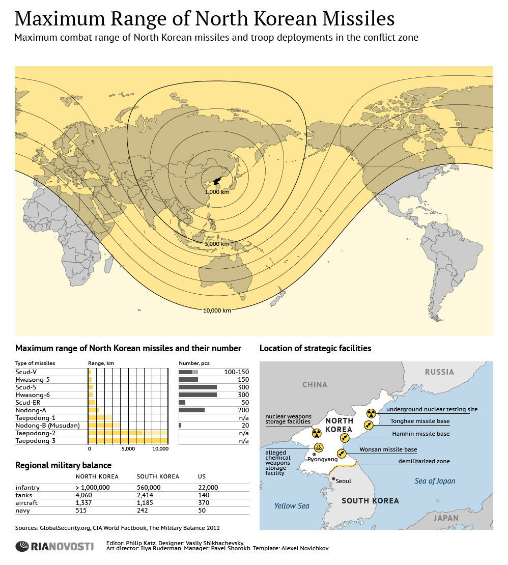
North Korea possesses a variety of missiles with different range capabilities. On one hand, there is the Scud-V with a range of less than 1,000 Km. that will easily reach South Korea, on the other there is the Taepodong-3 with a range of 10,000 Km. that could potentially reach the U.S. and Canada, as well as Europe.

In terms of balance in the conflict zone, North Korea outnumbers South Korea and the US forces combined in number of troops, tanks, aircraft and navy vessels.

Source: News Agency Ria Novosti

Suggested reading: The Brookings Institution: North Korea and Nuclear-Armed Missiles:  Calming the Hyperbole


Gasoline Prices in Europe by Country

According to Russian news agency Ria Novosti, Norway has the highest gasoline price among European countries, with a price of 1.90 Euro per liter ( or US $9.475 per gallon at the current exchange rate of 1 Euro = US $1.31). Norway is followed by Italy, Netherlands, Sweden, and Greece.

The lowest gasoline prices are found in Belarus and Kazakhstan, 0.68 Euros and 0.70 Euros per liter, respectively. The average gasoline price for European nations is 1.39 Euros per liter.


Number of Nuclear Tests Since 1945

North Korea conducted its third nuclear test on February, 2013. Two nuclear test preceded this one, the first in 2006, and the second in 2009.

However, the nation that has performed the largest number of nuclear tests since 1945 is the United States, a total of 1,032. In the same period, the USSR/Russia performed a total of 715 nuclear tests, and France performed a total of 210 nuclear tests.

Source: Statista: North Korea Conducts Third Nuclear Test


Total Carbon Emissions by Country

The Kyoto Protocol is an international treaty that seeks the reduction of greenhouse gases that contribute to global warming by setting emission reduction targets for industrialized nations. The Kyoto Protocol was signed on December 11, 1997 in Kyoto (Japan) by 191 countries. The United Stated signed the treaty, but later it did not ratify it.

This visualization by The Guardian shows total carbon emissions by country between 1997 and 2007, ten years since the protocol was signed.

The United States is the country that has produced the largest amount of carbon emissions (64,166 million tonnes) in the period 1997-2007 followed by China, Russia, Japan, India, and Germany.

Asia and Oceania combined are the regions with the highest carbon emissions produced in the same period (96,306 million tonnes). Asia and Oceania are followed by North America (U.S., Canada, and Mexico) with carbon emissions of the order of 74,867 million tonnes, and Europe with carbon emissions at 50,370 million tonnes as of 2007.


World Internet Users by Region

Of the 7 billion people in the world, only 2.4 billion are connected to the Internet, that is roughly 34% of the population as of 2012.

Internet penetration is the highest in North America (79%), followed by Oceania (68%), Europe (63%), and Latin America (43%).

Source: Statista: Only a Third of the World’s Population Is Online


Body Mass Index (BMI) by Country

A body mass index (BMI) between 18.5 and 24.9 is usually considered a healthy body weight to height relationship. A BMI of 25 or higher indicates body weight not optimal for the height of a particular person.

This visualization published by Visual.ly, shows the different BMI values for adult men and women across the globe.

Countries with a healthy average BMI between 20 and 22.9 include several nations in Africa, Yemen, India, Thailand, Japan, Pakistan, Singapore, among others.

Countries with an average BMI between 23 and 24.9 include several Asian nations, several European nations (including France), some nations in Africa, and Honduras.

Countries with an average BMI between 25 and 26.9 include Canada, Russia, Costa Rica, Colombia, Israel, Austria, Switzerland, Brazil, all Nordic countries, Spain, Portugal, and nations in the Middle East.

Countries with an average BMI of 27 and over  (the highest BMI range) include the United States, Kuwait, Cuba, Argentina, Chile, Bolivia, Peru, Venezuela, Australia, UK, New Zealand, Greece, and Germany to name a few.


Human Development Index 2012

The Human Development Index (HDI) is a composite measure that includes three indicators: life expectancy at birth, level of education attained, and income. The HDI is an alternative to the purely economical GDP, that quantifies economic growth only. Thus, the HDI provide a way to gauge the development of a country. The HDI for 2012 includes 187 countries.

The HDI ranks countries according to their degree of development using a scale from 0 to1, 0 being the least developed and 1 being the most developed country.

In the HDI map above, published by the Brazilian media site Globo.com we find that Norway has a score of 0.955, ranking number one as the most developed country (color green). Norway is followed by Australia, the U.S., the Netherlands, Germany, New Zealand, among others.

At the other end of the spectrum we find the least developed nations (color purple), including the majority of African nations, Pakistan, Afghanistan, Myanmar, Bangladesh, Nepal, and Papua New Guinea.


Billionaires and their Wealth by Country

This map of the world’s wealthiest citizens was created by Forbes. A total of 1,426 billionaires were found across the globe, worth $5.4 trillion combined.

The wealth of billionaires in the U.S. alone, 1,872.5 trillion, is larger than the combined wealth of billionaires in each continent. The wealth of the world’s richest in the Americas is an outstanding $2.4 trillion thanks to the contributions of billionaires mainly from the U.S., Brazil, Mexico, Canada, Chile, Colombia, Peru, and Venezuela.

The Americas are followed by Europe, where the wealth of its billionaires combined is valued at $1.55 trillion. Europe is followed by Asia with the wealth of its billionaires estimated at $1.16 trillion. Africa and the Middle East come at last, where the total net worth of its richest citizens is valued at $279 billion.


Number of Deaths in World War II

This visualization found in Wikimedia.org, shows World War II casualties per country by number and percentage of population, as well as the percentage of military and civilian deaths for the Allied and the Axis Powers.

The countries with the largest number of casualties were the Soviet Union, China, Germany, Poland, and Indonesia. As a percentage of the population, the nations with the  largest number of casualties were Lithuania, Poland, Latvia, Germany, and the Soviet Union.

For the Allied forces, the heaviest casualties were inflicted on the civilian population, whereas the largest number of casualties for the Axis forces were inflicted on the military.


Map of Internet Activity

click here to see the animation

Someone hacked thousands of computers all around the world in order to create a map of internet activity in the course of a day.

In this map from FastCo.Design, the red dots show peak internet activity around the world at different times of the day, while the blue dots show base traffic. Some interesting conclusions point to the fact that nighttime affects the U.S. and Europe very little, due to the fact that permanent internet connectivity is available.