Category Archives: Rankings

Number of Deaths in World War II

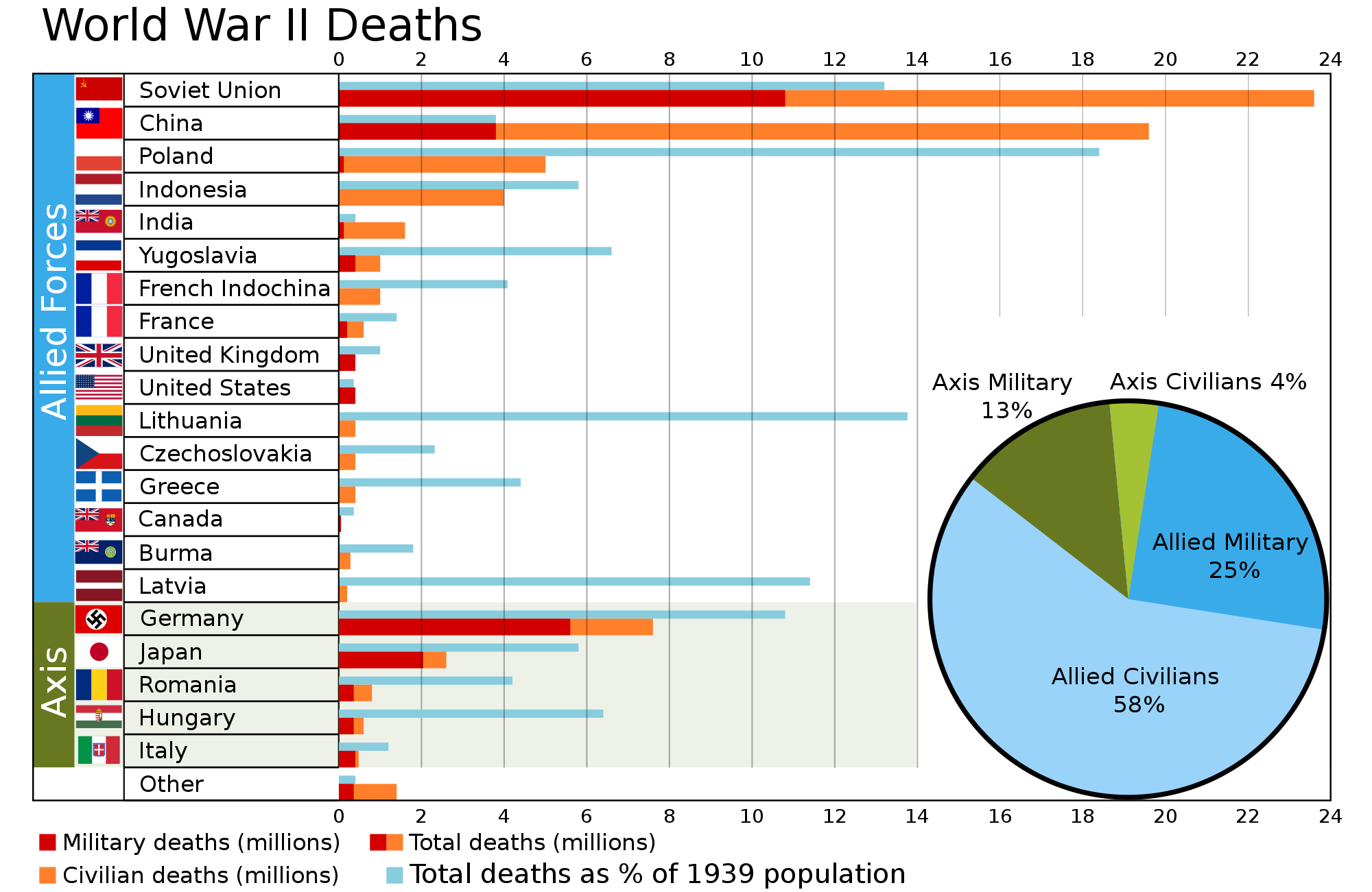
This visualization found in Wikimedia.org, shows World War II casualties per country by number and percentage of population, as well as the percentage of military and civilian deaths for the Allied and the Axis Powers.

The countries with the largest number of casualties were the Soviet Union, China, Germany, Poland, and Indonesia. As a percentage of the population, the nations with the  largest number of casualties were Lithuania, Poland, Latvia, Germany, and the Soviet Union.

For the Allied forces, the heaviest casualties were inflicted on the civilian population, whereas the largest number of casualties for the Axis forces were inflicted on the military.


Government Debt as a Percentage of GDP

Government Debt as a Percentage of GDP

Using data from Eurostat, we identified the top 10 European countries with the highest government debt as a percentage of GDP. The chart above shows that as of the third quarter of 2012, the latest period for which quarterly data is available, Greece, Italy, and Portugal had the highest government debt ratio. Ireland was close behind Portugal, with a ratio that has been increasing at the fastest rate out of all the countries in the list. Cyprus, which has been in the news lately due to problems in its banking sector, had a debt ratio not much higher than Germany.

Source: Eurostat

How Welcome Are Foreign Visitors in Your Country?

When traveling around the world, tourists do not know which countries will welcome them, and which countries won’t.

A recent report on world tourism by the World Economic Forum fills that void. The report compiled a list of the most and least friendly countries for tourists. Using a scale from 1 to 7, where 1 stands for the unfriendliest countries, and 7 stands for the friendliest nations, the report ranks countries according to the attitude of the population toward foreign visitors.

As seen in the map above, among the unfriendliest nations we find Bolivia, Venezuela, Russia, Kuwait, Latvia, Iran, Pakistan, Slovakia, Bulgaria and Mongolia. Among the friendliest nations we find Iceland, New Zealand, Morocco, Macedonia, Austria, Senegal, Portugal, Bosnia and Herzegovina, Ireland, and Burkina Faso.

Resource:  World Economic Forum: The Travel & Tourism Competitiveness Report 2013


Food Spending by Country

Food spending by country

The share of household spending devoted to food and drink varies widely by country, as shown in the chart above recently published by The Economist using data from the US Department of Agriculture. The chart shows that Americans spend less than 10% of their income on food and drink, whereas people in Cameroon spend close to 50%. What percentage of your income pays for food and drink?

Number of Doctors per 1,000 People per Country

The map above, created by the World Health Organization (WHO), shows the number of physicians per 1,000 people (for the latest available year) across the globe.

Countries with the largest number of physicians per 1,000 population include: San Marino (47.35), Cuba (6.72), Greece (6.17), Monaco (5.81) and Belarus (5.18).

Countries with the smallest number of doctors per 1,000 people include: Colombia, Nicaragua, Haiti, Liberia, Niger, sierra Leone, Rwanda, Ethiopia, Yemen, Afghanistan, Myanmar, Thailand, Cambodia, Indonesia, Papua New Guinea, etc.

The Presence of McDonald’s Across the World

click to enlarge

One of the companies that symbolizes the dominance of US. corporations across the world is McDonald’s. McDonald’s is the second largest fast food chain in the world, according to a Nasdaq report for 2011, with more than 33,510 restaurants in 119 countries spread across all five continents.

The U.S. has the largest number of McDonald’s restaurants (13,381), followed by Japan (3,598), Canada (1,400), Germany (1,276), UK (1,250), and China (660).

The price of a McDonald’s burger is different in each country. According to the graph above, the most expensive ones can be found in Norway ($7.18), Denmark ($5.93), Iceland ($5.21), and in the Eurozone ($4.96). By comparison, the price of a McDonald’s burger in the U.S. is $3.57. These prices have been calculated using the Big Mac index published by The Economist, in order to measure the Purchasing Price Parity (PPP) between two currencies.

Resources:

  1. American Icons Temple: A Market-Dominant Minority that is McDonald’s
  2. Nasdaq: Subway tops McDonald’s for number of stores in world
  3. United States Securities and Exchange Commission – Form 10-K: McDonald’s Corporation
  4. The Economist: Big Mac Index


The Origins and Age of Popes

In the light of Pope Benedict XVI’s resignation last week, The Guardian created different visualizations related to the papacy. The reign of each Pontiff is usually due to death. The last one to resign was Gregory XII in 1415.

According to the graph shown above, 65 is the most common age at which Popes are elected, and 78 is the most common age at which they die. The Guardian used a sample of 63 Popes out of 266 to compute these numbers.

Of all 266 Popes, 196 came from Italy (74%). The origin cannot be traced for 22 Popes (8%). 15 Popes came from France (6%), 11 from Greece (4%), 5 from Germany, 5 from Syria, 3 from Africa, 3 from Spain, 2 from Portugal, and 2 from the West Bank. Countries from which only one Pope came from include: Croatia, Israel, Netherlands, Poland, and the UK.


Food Exports and Imports Worldwide

Some countries are net exporters of food (their food exports are larger than their food imports) while others are net importers of food (their food imports are larger than their food exports).

Among the net exporters of food we find the majority of South American countries, with the exception of Venezuela and Suriname, the United States, Canada, Mauritania, Indonesia, Australia, and a few African countries such as Mauritania, Ivory Coast and Ghana. The largest net exporter of food, by far, is Argentina with $23.42 of food exports per every $1.00 of food imports. Argentina is followed by Brazil, New Zealand, Paraguay and Iceland.

Among the net importers of food we find countries such as Russia, Finland, Sweden, the UK, Italy, Germany, Portugal, Sudan, Cuba, Saudi Arabia, Japan, etc. The largest net food importer is Eritrea, with $0.01 of food exports per every $1.00 of food imports. Eritrea is closely followed by Venezuela, Turkmenistan, and Algeria.

Data for for both agricultural exports and imports are for 2010.

Source: Slate.com: Maps: Agriculture in the U.S. and Around the World


Journalism: A Dangerous Profession

Journalism is a very dangerous profession. Many journalists are killed every year around the world while covering everything from business and sports to revolutions, wars, political upheavals, corruption, human rights violations and more.

In 2012 alone, 103 journalists were killed around the globe. Motives were confirmed for 70 of them. The deadliest countries for journalists in 2012 were Syria (28 deaths), Somalia (12 deaths), Pakistan (7 deaths), and Brazil (4 deaths). The motives where the confirmed in these cases.

The way journalists are killed, range from crossfire or combat to murder. Impunity is a shocking 100% for murder cases. More detail in the chart below:

For additional information, including the list of the journalists killed in 2012, visit: Committee to Protect Journalists: 70 Journalists Killed in 2012/Motive Confirmed


Coffee Consumption Per Capita Worldwide

Coffee production and consumption is believed to have originated in Africa, more specifically in the province of Kaffa, Ethiopia. In the fifteen century it was already present in the Middle East. From there it spread to Italy and then to the rest of Europe. From Europe it traveled to the New World, where it was first cultivated in the Caribbean island of Martinique. During the first quarter of the eighteen century it was brought to Colombia and Brazil.

Coffee is an important cash crop in many developing countries. It is also an important commodity traded in major commodity exchanges around the world. The largest coffee producers include: Burundi, Ethiopia, Rwanda, Honduras, Uganda, and Nicaragua among others.

According to ChartsBin, coffee consumption around the world is estimated at 1.3 Kilograms per person per year (a total of 7,358,897 metric tons). In the map above, we can see that the countries with the largest coffee consumption per capita include: Finland (12 Kg. per person per year), Norway, Iceland, Denmark, Netherlands, Switzerland, followed by Canada, Germany, Brazil and other western European nations.

Sources: