Category Archives: Demographics

North Korea vs. South Korea

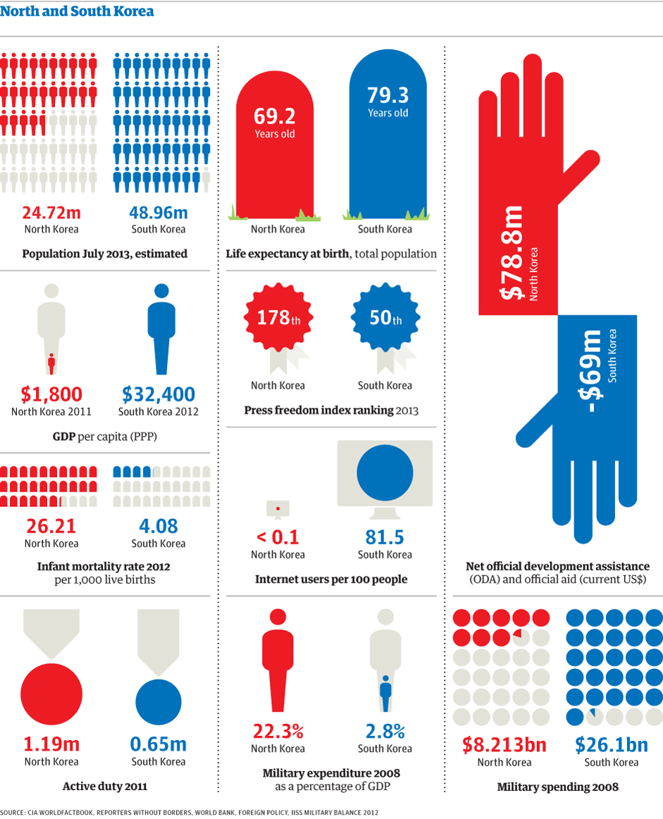
In this visualization created by The Guardian, we can see how North Korea compares to South Korea in terms of population, Gross Domestic Product (GDP), life expectancy, freedom of the press, military spending, internet connectivity, infant mortality, among other indicators.

North Korea is a poor country with half the population of South Korea. It is one of the worst countries in terms of corruption and freedom of the press. Its military spending constitutes approximately 22.3% of its GDP, compared to 2.8% for South Korea.

Additional resource: IndexMundi: South Korea vs. North Korea – Country Comparisons


Human Development Index 2012

The Human Development Index (HDI) is a composite measure that includes three indicators: life expectancy at birth, level of education attained, and income. The HDI is an alternative to the purely economical GDP, that quantifies economic growth only. Thus, the HDI provide a way to gauge the development of a country. The HDI for 2012 includes 187 countries.

The HDI ranks countries according to their degree of development using a scale from 0 to1, 0 being the least developed and 1 being the most developed country.

In the HDI map above, published by the Brazilian media site Globo.com we find that Norway has a score of 0.955, ranking number one as the most developed country (color green). Norway is followed by Australia, the U.S., the Netherlands, Germany, New Zealand, among others.

At the other end of the spectrum we find the least developed nations (color purple), including the majority of African nations, Pakistan, Afghanistan, Myanmar, Bangladesh, Nepal, and Papua New Guinea.


The World as 100 People

In this interesting infographic, created by Jack Hagley, we take a look at the world as if the total population of the world was 100 people. The information presented covers topics such as the distribution of gender, information, spoken languages, literacy, religion, age, housing, water, nutrition, and population inhabiting each continent.


Health Insurance Rates by County for the U.S.

This map from The Daily Biz, created using data from the U.S. Census Bureau, shows health insurance rates by county for people under the age of 65 across the United States.

Darker areas represent the counties with higher rates of uninsured Americans, while lighter areas represent the counties with lower rates of uninsured people under age 65.

The higher rates of uninsured Americans can be found concentrated in the Western and Southwestern estates, and in some parts of the Southeast. By contrast, the rate of uninsured Americans is lower in the Northeast and parts of the Southeast and Midwest.


Male Gender Preference Globally

In this day and age, it is still surprising that in most parts of the world, there is still a preference for sons over daughters. It is even more surprising when you are talking about developed nations such as Spain, Portugal, Switzerland, Canada, Australia, New Zealand, Japan, and South Korea.

Other nations where the preference of sons overs daughters is extremely abnormal include China, India, Myanmar, Vietnam, and Malaysia among others.

Resource: Women Stats: Map – Son Preference and Sex Ratios


Expected Years of Schooling for Females Worldwide

The expected years of schooling for females varies from country to country.

Developed nations such as the United States, Canada, the UK, France, Germany, Norway, Iceland, Australia, New Zealand, etc., show the highest number of expected years of schooling (15 to 21 years) for girls. Other nations in this group include Argentina, Uruguay, Kazakhstan, Libya, and South Korea.

On the other hand, countries with the lowest number of expected years of schooling (0 to 8 years) for females include most African countries, Pakistan, Afghanistan, Iraq, Yemen, Myanmar, Bangladesh, and Papua New Guinea.

Resource: The World Bank DataBank: Gender Statistics – Expected years of schooling for females

Life Expectancy at Birth for Women

Life expectancy at birth, for women, varies significantly across the world.

On one side of the spectrum, we find nations where the life expectancy at birth for females is 80.5 years or more. Countries in this group include the United States, Canada, Chile, several developed nations in Northern, Southern and Eastern Europe, Australia, New Zealand, Japan, and South Korea.

On the other side, we find nations where the life expectancy at birth for females is much lower, 62.0 years or less. This group is comprised by the majority of African countries, with the exception of North African nations, and Afghanistan.

Resource: The World Bank DataBank: Gender Statistics – Life expectancy at birth, female (years)


We Live Longer

click to enlarge

Average global life expectancy is now 70.4 years; 73.3 for women and 67.5 for men.

Life expectancy has gone up significantly in places like Iran, Bangladesh, the Maldives, South America and Africa, where the increase has been of 13 years or more, compared to previous decades. North America, Western Europe and Australasia have seen a modest increase of 7 plus years.

The rise in life expectancy has been possible thanks to the improvement in health programs and the control/cure of many infectious diseases that ended up in death, especially in young children.

But, there are places where the rise has been negligible like Eastern Europe, with an average increase of just 1 year. Other places have even experienced a decline in life expectancy. Such is the case of Lesotho and Belarus, which have seen a rise in HIV and alcoholism, respectively.

According to a report published by The Lancet, although we live longer now, the quality of life has declined due to the rise in obesity and its consequences: diabetes, high blood pressure and heart conditions.

Resources:


The Best and Worst Places to be Born in 2013

Back in 1988, the United States was ranked first as the best country to be born. Twenty five years later, the U.S. is ranked number 16.

The Economist Intelligence Unit compiled the where-to-be-born index which measures which country will provide the best opportunities to someone born in 2013. It links the results of life satisfaction surveys to indicators that affect the quality of life in those countries, such as geography, demographics, culture, government policies, the economy, etc.

Based on those factors, the best places to be born are Switzerland, Australia followed by Norway, Sweden Denmark, and Singapore. At the bottom of the list you will find Nigeria, Kenya, Ukraine, Bangladesh, Angola, Pakistan, among others.


Megacities Around the World

click to enlarge

Back in 1950, New York and Tokyo were the only two megacities, with populations larger than 10 million inhabitants. By 2010 the number of megacities had increased to 23, including cities like Mexico City, Los Angeles, Sao Paulo, Rio de Janeiro, Buenos Aries, Paris, Moscow, Cairo, Istanbul, Delhi, Karachi, Mumbai, Dhaka, Beijing, Shanghai, Manila, besides New York and Tokyo, the largest megacity with a population of 36.9 million. For 2025, it is estimated that there will be 29 megacities around the globe. Click here for the interactive map.