Category Archives: Bolivia

Drought Severity by Country (1901 – 2008)

drought severity world
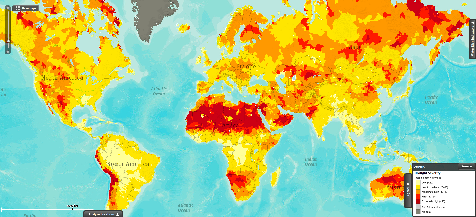
This map shows drought severity, measured as the product of the average length of a drought occurrence and how dry it was the drought. This visualization is based on data collected for the period between 1901 and 2008.

The red areas in the map show the regions most severely affected by droughts. The northern region of the African continent stands out as the largest area being affected by severe droughts. Southwestern Africa (Namibia and Botswana) has also been severely affected by droughts in the same period.

Some areas in the Andean region in South America (Ecuador, Peru, Bolivia, Chile and Argentina) have also suffered the effects of severe droughts during the past century.

Parts of Australia and Russia have also been affected by extreme drought conditions.

Sources:


Body Mass Index (BMI) by Country

A body mass index (BMI) between 18.5 and 24.9 is usually considered a healthy body weight to height relationship. A BMI of 25 or higher indicates body weight not optimal for the height of a particular person.

This visualization published by Visual.ly, shows the different BMI values for adult men and women across the globe.

Countries with a healthy average BMI between 20 and 22.9 include several nations in Africa, Yemen, India, Thailand, Japan, Pakistan, Singapore, among others.

Countries with an average BMI between 23 and 24.9 include several Asian nations, several European nations (including France), some nations in Africa, and Honduras.

Countries with an average BMI between 25 and 26.9 include Canada, Russia, Costa Rica, Colombia, Israel, Austria, Switzerland, Brazil, all Nordic countries, Spain, Portugal, and nations in the Middle East.

Countries with an average BMI of 27 and over  (the highest BMI range) include the United States, Kuwait, Cuba, Argentina, Chile, Bolivia, Peru, Venezuela, Australia, UK, New Zealand, Greece, and Germany to name a few.


How Welcome Are Foreign Visitors in Your Country?

When traveling around the world, tourists do not know which countries will welcome them, and which countries won’t.

A recent report on world tourism by the World Economic Forum fills that void. The report compiled a list of the most and least friendly countries for tourists. Using a scale from 1 to 7, where 1 stands for the unfriendliest countries, and 7 stands for the friendliest nations, the report ranks countries according to the attitude of the population toward foreign visitors.

As seen in the map above, among the unfriendliest nations we find Bolivia, Venezuela, Russia, Kuwait, Latvia, Iran, Pakistan, Slovakia, Bulgaria and Mongolia. Among the friendliest nations we find Iceland, New Zealand, Morocco, Macedonia, Austria, Senegal, Portugal, Bosnia and Herzegovina, Ireland, and Burkina Faso.

Resource:  World Economic Forum: The Travel & Tourism Competitiveness Report 2013


Mortality Numbers for Children Under Five

In 2011, 6.9 million children under five years old died around the globe from different causes ranging from pneumonia, malaria, diarrhea, HIV/AIDS, meningitis, to all kinds of injuries.

The number of deaths of children under five has decreased by 59% in the last forty years, from 16.9 million back in 1970 to 6.9 million in 2011. That is good news for the world in general; however, there are still regions in the planet where under-five mortality rates have changed hardly at all. That is the case of Africa, where countries with the highest under-five mortality rates include Sierra Leone, Somalia, Mali, Chad, Democratic Republic of the Congo, Central African Republic, Guinea-Bissau, and Angola. In other parts of the world, countries with high under-five mortality rates include Afghanistan, India, Pakistan, Papua New Guinea, Haiti and Bolivia.

Income is a critical factor influencing under-five mortality rates, as shown in the graph above. The larger the income per capita of a nation, the lower the mortality rate. Such is the case of developed economies like Luxembourg or Norway, in stark contrast with developing countries like Somalia or Sierra Leone, where income per capita is very low.

Source: Health Intelligence: Under-five Mortality dashboard


Is your country going to meet its millennium development goals?

Now that the millennium development goals section is available, I can check whether any given country is likely to meet its goals. Taking Bolivia as an example, I can see that some indicators are changing in the right direction, but others are not. For instance, the percentage of the population who consume less than one US dollar (purchasing power parity), changed from 20.4% to 14.4% between 1997 and 1999, a clear improvement. However, between 1999 and 2002 the percentage increased from 14.2% to 23.2%, a marked worsening. I’m assuming that the 1991 number (5.7%) is incorrect since it’s so much lower than subsequent measurements. If it were correct, it would mean that the 1990s was a completely lost decade.

I’m working on making it easier to keep track of these types of changes. I’ll probably add a scorecard-type of interface that will display all indicators graphically.