Category Archives: Demographics

Income Distribution by Religious Belief Groups

Click to enlarge

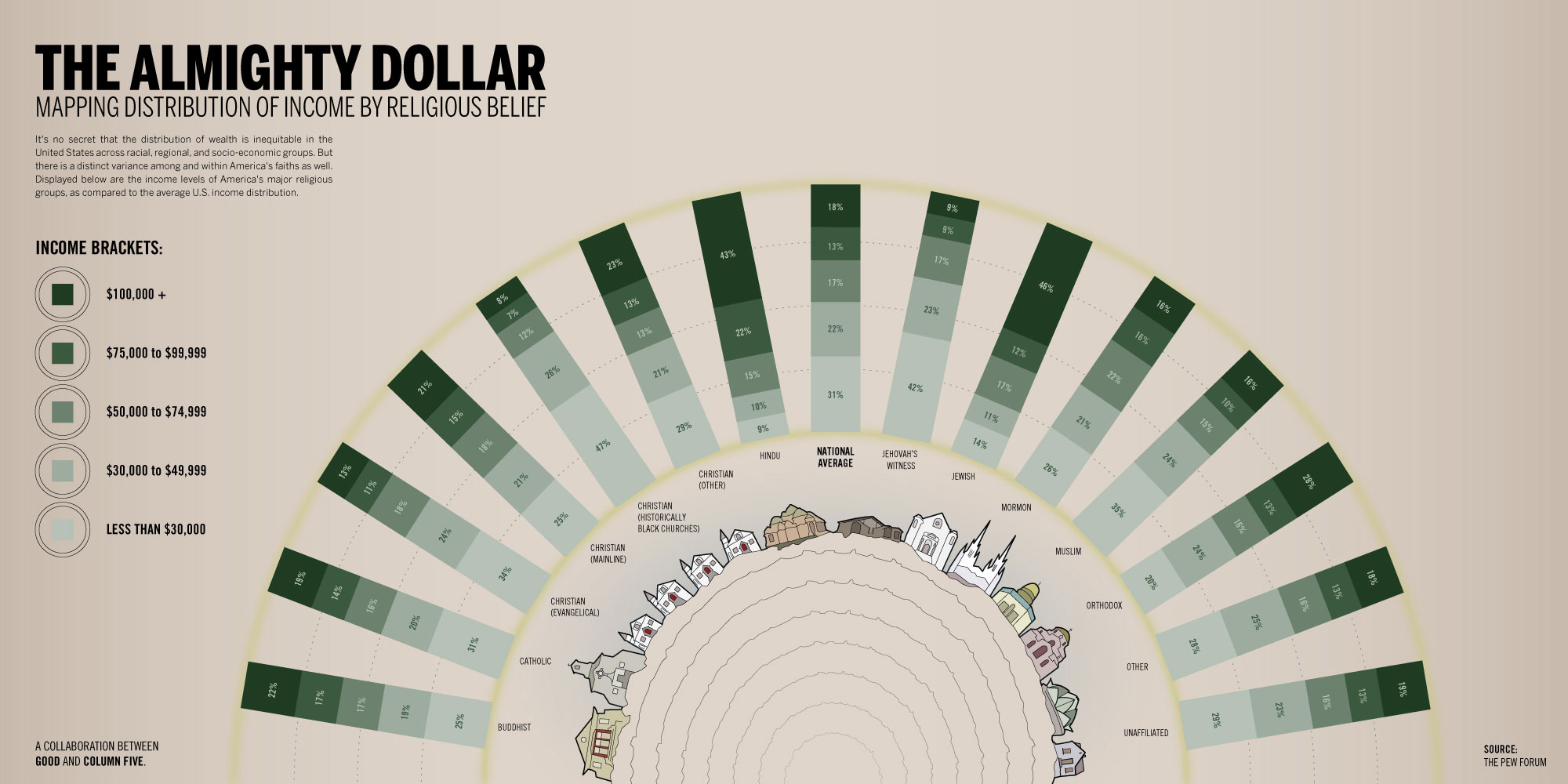
This infographic by GOOD shows the income distribution according to different religious belief groups. It is interesting to notice that 43% of people with Hindu beliefs earn an average income of 100K or more. For people with Jewish beliefs the percentage is 46%, compared to 21% for people with Christian beliefs (mainline), and 8% for people with Christian beliefs (Black churches). Click on the image for more detail.
 

Life Expectancy vs. Fertility Rates Worldwide 1960-2010

click to enlarge

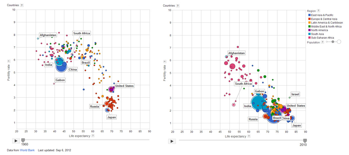
During the last fifty years, we have seen the gradual increase in life expectancy and the corresponding decrease in fertility rates worldwide. This is clearly the case of countries like China, India, the United States, Brazil, Japan, and Gabon, where dramatic improvements can be seen. On the other hand, countries like Russia, South Africa and Afghanistan, show moderate improvement.

It is very interesting to note, that although they have improved, a large cluster of African countries remain far from the overall trend, with lower life expectancy rates and higher fertility rates. For more information, check Google’s interactive bubble chart based on World Bank data.


Animated Map Visualizations

You can now explore 11 years worth of changes in the demographic characteristics of all U.S. counties through our animated map visualizations. Try the following indicators:

The Rise of Residential Segregation by Income

residential segregation by income

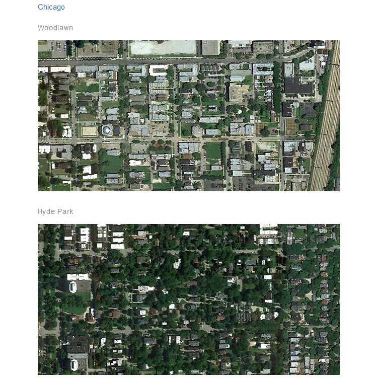
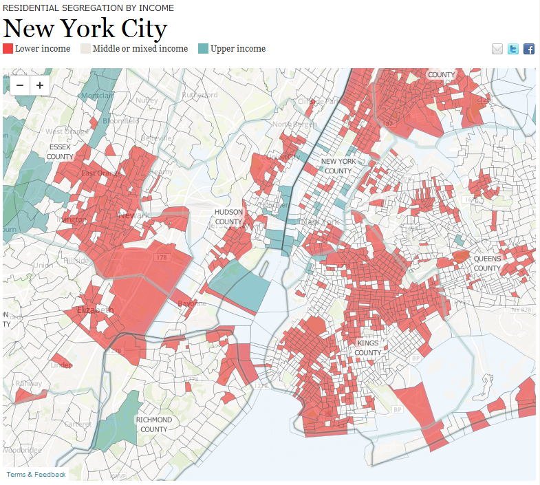
A new report by the Pew Research Center shows that residential segregation by income in the U.S. has increased during the past 30 years in 27 of the 30 largest major metropolitan areas. Check the report to find out details about your city. You can also click on the map above to see visualizations of income segregation for the largest metropolitan areas, e.g. New York, Los Angeles, Chicago, and Houston.