Tag Archives: democrats

Political Polarization in the US

US Presidential election results in North Carolina 1996-2012

As we start analyzing the results of the 2012 presidential election in the US, it is becoming clear that political polarization continues to increase across the country. Take North Carolina for instance. As the thematic maps above show, the number of counties where the Republican party won by 40% or more reached a new high in 2012. This year there were 14 deeply red counties, compared to only 4 in 2008. On the other hand, there were 10 deeply red counties in 2004, which suggests that 2008 was an outlier due to the extraordinary circumstances that allowed Obama to win the state.

The Role of Social Media in Politics

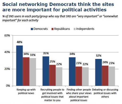
The role of social media in the political arena has increased considerably as of lately. During the Democratic National Convention, last week, it was clear that social media was an important channel for disseminating information as events were taking place. According to the online site TechCrunch, first lady Michelle Obama’s speech had generated 28 thousand tweets per minute.

A report published by the Pew Research Center, based on a survey on social network site users, states that Democrats are more likely to consider the use of social media important or very important in keeping up with political news, recruiting people for their cause, discussing political issues with other people and finding other people who share their political views, compared to their Republican or Independent counterparts.

Visualizing Presidential Election Results

Presidential election results for North Carolina counties 1996-2008

As we get closer to the 2012 presidential elections in the U.S., we are taking another look at the results of past elections to see if we can discern any patterns. Our first attempt consists of visualizing the margin of victory of each major party in the state of North Carolina. The map above shows the county by county results for the past four elections (click on the map for a larger version). Counties shaded red were won by the Republican party, while counties shaded blue were won by the Democratic party. Deeper shades are used to represent counties where the margin of victory was relatively large. Take Yadkin county for example. In 1996 it was the only county in the state where the Republicans won by over 40%, hence its deeper red color. Note that counties where the margin of victory was less than 5% are colored white.

For those of you wondering how we created the map, we used the IndexMundi thematic map creator. The election results data came from the North Carolina State Board of Elections.