We are now tracking the historical prices of four additional commodities:
We are now tracking the historical prices of four additional commodities:
We added today twenty new indicators to our World Bank data set:
After the financial crisis of the recent years, there are countries that have fared better than others, due in part to a transfer of capital from financial markets in developed countries to emerging market economies.
To identify the winners and losers, economists Ignacio Munyo and Ernesto Talvi calculated a Global Index of Economic Exuberance where the winners are Argentina, Angola, and Brazil, and the losers are Hungary, the United States, and Kazakhstan.
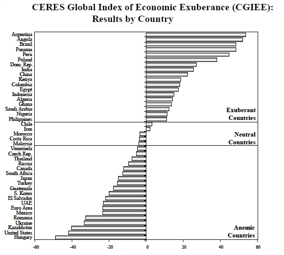
CERES: Center for the Study of Economic and Social Affairs
We released today a new derived indicator using data from the CIA Factbook: Natural Gas Consumption per Capita.
We released today a new derived indicator using data from the CIA Factbook: Electricity Consumption per Capita
We added a new derived indicator using data from the CIA Factbook: crude oil consumption per capita.
I thought it would be interesting to share a snapshot of our traffic graphs to show how Internet access to our site has been affected during the uprisings in the Middle East. Let’s start with a graph showing visits from Tripoli, the capital of Libya.

The graph above shows that access to the Internet in Tripoli has been virtually non-existent since February. It will be interesting to see how fast traffic recovers once it gets restored.
Contrast the graph above to the traffic chart for Cairo (Egypt):

As shown above, visits from Cairo dipped considerably for a few days at the end of January / beginning of February, but it recovered fairly quickly once Mubarak stepped down.
The final graph I wanted to share is for Tunis, the capital of Tunisia:

It is remarkable that visits from Tunis were largely unaffected despite the turmoil that started in December 2010 and continued until the ouster of President Ben Ali on January 14th, 2011.
We are currently processing the results of our commodities trade survey. We figured that a good way to display the results would be through a map visualization showing trade flows to and from each country represented in the survey. The image below shows one of the visualizations (click on it for a larger version).

The map shows trade flows from Australia. Lighter lines represent trade flows with a small number of deals. Darker lines are used for trade flows with larger number of deals. Stay tuned for more results.
Update (August 15th, 2011): You can now play with our trade flow visualizations.
Historical commodity prices updated with Dec 2010 data. Salmon & copra jumped over 13% in 1 month