Category Archives: Topics

Corruption Indicators

Firms expected to give gifts in meetings with tax officials (% of firms)

For someone living in a country where corruption is widespread, it is very easy to cite examples of corruption, bribery, graft, traffic of influences, nepotism, etc. Measuring corruption in a systematic way is, in contrast, a much more difficult task. Going through the database of World Bank indicators we found two indicators directly related to corruption:

Click on the links above to find out where your country ranks in terms of corruption. Note though that the World Bank does not have data for all countries.

For a far more comprehensive effort at measuring corruption, you may want to check the web site of Transparency International and its annual reports on corruption.
World Population Day – July 11, 2012

  1. World Population Day | 2012 Theme: Universal Access to Reproductive Health Services (United Nations)
  2. Family planning in South Asia: Improving equity of access – Julie McLaughlin (World Bank)
  3. Population Of The World Tops 7 Billion Ahead Of World Population Day 2012 (Huffington Post)
  4. Nine population strategies to stop short of 9 billion – (PeakOil.com)
  5. World Population Day 2012 – Michael Evans – (Earth Times)

World Malaria Day

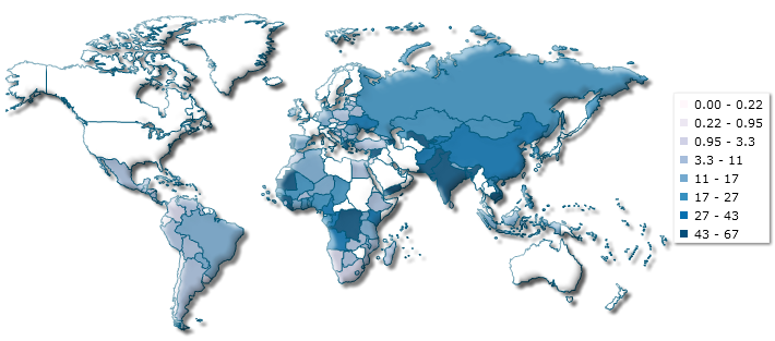
Today is World Malaria Day, a day for recognizing the global effort to provide effective prevention and treatment of malaria. We currently have two thematic maps which help illustrate the impact of malaria on the population of our planet:

Learn more about the fight against malaria at the Roll Back Malaria site.

World Health Day

Today is World Health Day in commemoration of the founding of the World Health Organization (WHO). Here are some country health indicators which are relevant to the state of human health in our planet.

Are you surprised by any of the indicators above?

Income Inequality in Greece

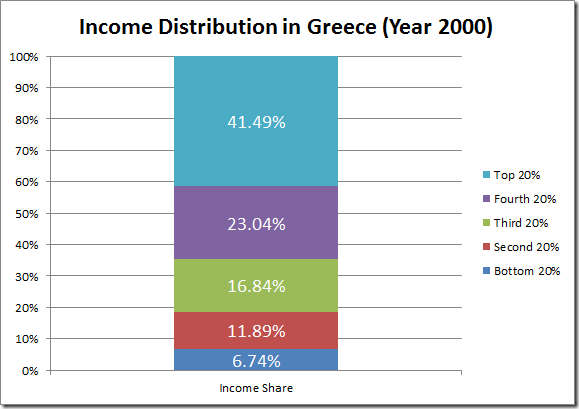
As the political situation in Greece continues to deteriorate, we decided to take a look at the income distribution statistics we have for the country. Take a look at the graph we created based on World Bank numbers:

image

The graph shows the income share for each quintile of the population. The top 20% has a 41.49% share of income, while the bottom 20% has a 6.74% share.

Note that all income share numbers are from the year 2000. We have not been able to locate more recent data, although the CIA World Factbook publishes GINI index numbers which are more recent.

It will be interesting to see how the distribution of income in Greece changes once the effect of the current crisis is quantified.

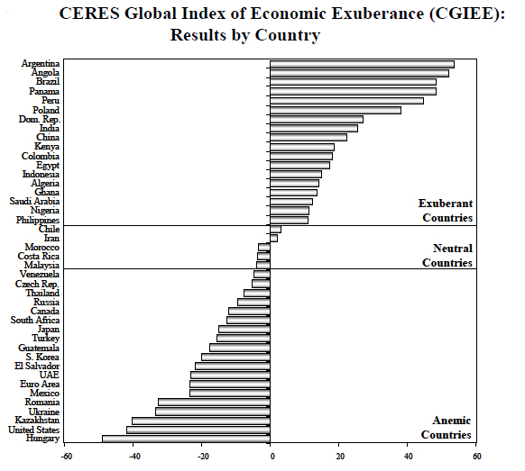
Global Index of Economic Exuberance

After the financial crisis of the recent years, there are countries that have fared better than others, due in part to a transfer of capital from financial markets in developed countries to emerging market economies.

To identify the winners and losers, economists Ignacio Munyo and Ernesto Talvi calculated a Global Index of Economic Exuberance where the winners are Argentina, Angola, and Brazil, and the losers are Hungary, the United States, and Kazakhstan.

CERES: Center for the Study of Economic and Social Affairs

Tax Revenue Per Capita

Today we improved our US state tax revenues section by adding a new variable: tax revenue per capita. Check out the map below for an example showing tax revenue per capita for tobacco products:

New Hampshire collects the most taxes on a per capita basis than any other state. Now we will have to look for data showing if high taxes on tobacco products result in lower numbers of smokers.