Author Archives: Miguel Barrientos

Billion Dollar Weather Disasters

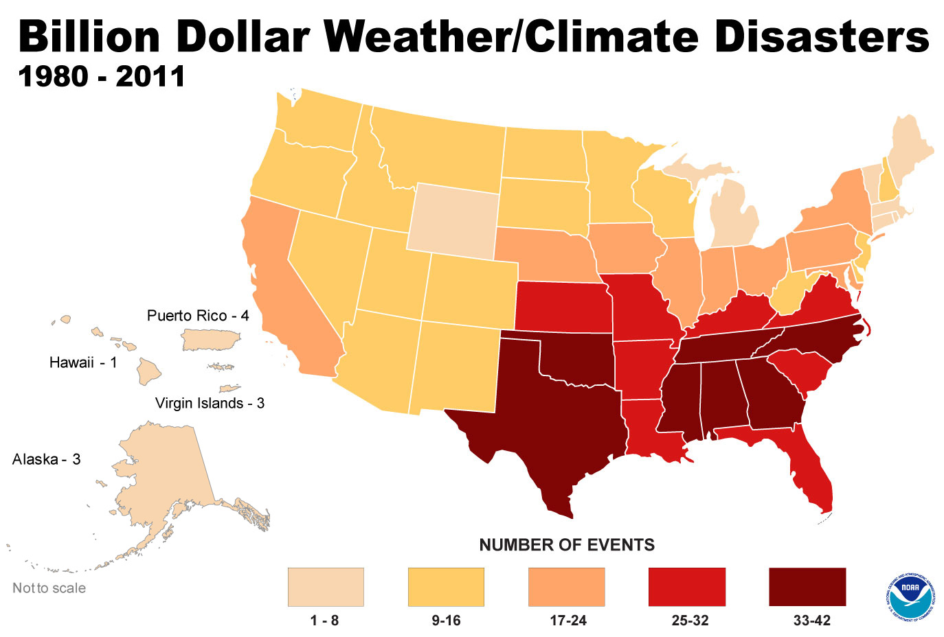
Billion dollar weather events by state

As the economic damage from Hurricane Sandy is still being evaluated, we took a look at the damage from weather/climate-related disasters over the past 30 years. The National Climatic Data Center (NCDC) at the National Oceanic and Atmospheric Administration keeps detailed statistics of all weather disasters in the US. One of the visualizations the NCDC has created is a thematic map of billion-dollar weather events, which can be seen above. The map shows the number of events that caused at least a billion dollars in damage by state. Southern states suffered the most damage up until 2011. The colors in the map may look significantly different once the total tally of Sandy is calculated.
The World’s Least and Most Dynamic Countries

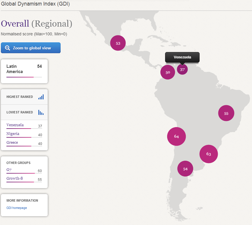
Global Dynamism Index

Grant Thornton International and the Economist Intelligence Unit have just released a Global Dynamism Index, which ranks 50 economies on 22 indicators of dynamism. Countries which have a positive reading on these indicators have recovered faster since the 2008 global recession, and are also on a path to higher future growth. Singapore, Finland, and Sweden are at the top of the list of the world’s most dynamic countries, whereas Nigeria, Greece, and Venezuela are at the bottom.

First Names and Politics

An analysis of donor data from the Federal Election Commission (FEC) conducted by Chris Wilson at Yahoo News suggests that first names may be a predictor of a person’s political affiliation. It turns out that Republicans seem to have a hold on names like Donald and Sharon, whereas Democrats attract contributions from people with names like Angela and Willie. You can play around with the data and draw your own conclusions using the embedded chart.

Youth Unemployment in Europe and the US

Youth unemployment in Europe and the US

A new report from Eurostat shows that the economic crisis in Europe is creating rising unemployment throughout the continent. The 25 years old and under age group has been the hardest hit by a wave of layoffs and by the reluctance of firms to hire. In Greece and Spain, youth unemployment has risen above 50%, a level which has been fueling mass protests and even violence. Check the article at The Atlantic for a more detailed discussion about the graph above.

Armed Conflicts in Africa

Map of armed conflicts in Africa 1997-2011

According to the Armed Conflict Location and Event Dataset (ACLED), the number of civil wars across the developing world has decreased over the past fifteen years, but the levels of political violence have remained relatively stable. As the number of battles decreased, riots, protests, and violence against civilians increased. To get a better understanding of the geographical distribution of violent incidents in Africa, Francisco Dans used ACLED data to create the map displayed above. The map shows all the incidents captured by ACLED between 1997 and 2011.

The Relationship Between Riots and High Food Prices

The relationship between riots and high food prices

According to a new study released by researchers at the New England Complex Systems Institute in Cambridge, high food prices play a direct role in the rise of political instability in North Africa and the Middle East. As shown in the graph above, when the UN food price index rises above a certain level, the number of riots increases around the world. The study mentions two factors that are leading to higher food prices: investor speculation in the commodities market, and the use of corn for the production of ethanol in the US.

The Catholic States of America

Religion in the US - Catholic Rates of Adherence County Map

Membership in the Catholic church in the US has increased in recent years primarily due to immigration from Latin America. States with large Irish- and Italian-American populations also have significant numbers of Catholics. The map above shows membership per 1000 people for all counties in the US. New Mexico, California and Texas have the highest rates of adherents.

Note: The data were downloaded from the Association of Religion Data Archives, www.TheARDA.com

The Evangelical States of America

Religion in the US - Evangelical Protestant Rates of Adherence County Map

Continuing our series of maps about religion in the US, today we take a look at membership in Evangelical Protestant churches. The map above shows the rate of adherence per 1,000 people for all counties in the US (click on the map for the full-size version). Darker colors represent a higher rate of adherence. We split the data into five equal ranges: <200, 200-400, 400-600, 600-800, and > 800. The highest adherence rates can be found in the southern states, which are the traditional stronghold of the Evangelical movement.

Note: The data were downloaded from the Association of Religion Data Archives, www.TheARDA.com