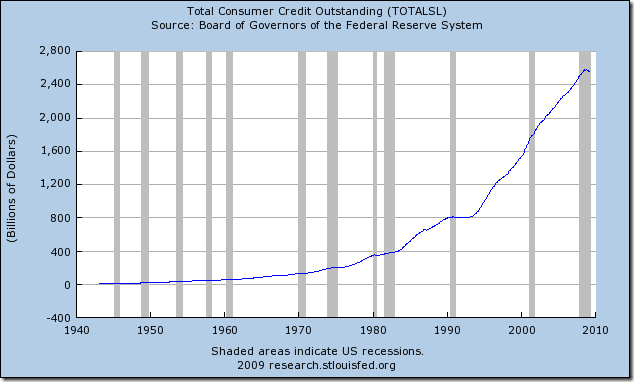
A sobering graph from the St. Louis Fed shows the total consumer credit outstanding in the US. It’s clear from the graph that consumer borrowing went into overdrive starting in the early 1990s. The big question for creditors now is how much of the borrowed money will be paid back while unemployment continues to increase.

Source: Federal Reserve Bank of St. Louis
This chart while precise is somewhat incomplete. The consumer over drive might be worse (or not so bad) if US population is taken into account. More people means more burrowing. A more complex factor would be wealth an income: What percentage of Wealth does this debt reprent and what percentage of income? If you are a millionnar, $500 of debt is insignificant and we certainly have much more millionnares even now during a recession. Also what percentage of annual and monthly Salary do these debts represent?
Yes, per capita data is in the end more “expressive” in our times of globalisation.
But I still find it an interesting graph that illustrates real growth: of debt and indebtedness on every possible level.
Have just created a link from my latest blog http://publicdebts.wordpress.com