I just published region-level demographic data for Italy. A Spanish translation is also available.
I just published region-level demographic data for Italy. A Spanish translation is also available.
If you can read Spanish you can now look at state-level population statistics for Mexico.
Just wanted to let you know that the new url for New Zealand is http://www.indexmundi.com/new-zealand/
One of the most popular sections in IndexMundi is the country comparison charting page. It allows you to chart one or more data series for one or more countries. An interesting example of what I’m talking about is a page that displays the population, GDP, and the number of people fit for military service for Afghanistan, Iran, and Iraq. If you’ve used the comparison page in the past you’ll notice that I’ve made three important improvements. First, I’ve updated the charts with the most recent CIA Factbook numbers. Second, I’ve cleaned up a number of data quality problems that affected some of the graphs. I’m confident that I’ve eliminated most errors, and hope that you’ll let me know if you find any discrepancies. Finally, I’ve changed the default chart type from vertical 3D bars to 2D lines. Trend data is easier to visualize through line charts. Enjoy!

A quick note to let you know that thanks to the United States Department of Energy, I now have complete production and consumption numbers for crude oil, dry natural gas, coal, nuclear, and hydroelectric power. The data covers the period 1980-2004, and it is presented in nice charts and tables.
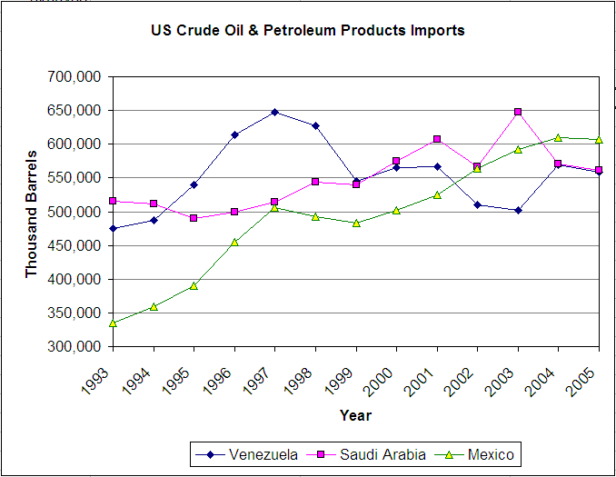
The US Energy Information Administration (EIA) has detailed data about US Crude Oil imports by country of origin. I used their data to create a chart showing US imports of crude oil and other petroleum products from 1993 to 2005. The chart shows that the top exporter of crude oil to the US is Mexico, followed by Saudi Arabia and Venezuela. If all goes well I will be adding similar charts to IndexMundi for easy visualization of oil & gas production, supply, and distribution data.
Over the course of the last year, the US dollar has lost 10.8% of its value with respect to the Euro. Why do I mention it? To highlight a feature of our exchange rate graphs. You can now see the total percentage change for a given timeframe on the upper right of the chart.
Now that the millennium development goals section is available, I can check whether any given country is likely to meet its goals. Taking Bolivia as an example, I can see that some indicators are changing in the right direction, but others are not. For instance, the percentage of the population who consume less than one US dollar (purchasing power parity), changed from 20.4% to 14.4% between 1997 and 1999, a clear improvement. However, between 1999 and 2002 the percentage increased from 14.2% to 23.2%, a marked worsening. I’m assuming that the 1991 number (5.7%) is incorrect since it’s so much lower than subsequent measurements. If it were correct, it would mean that the 1990s was a completely lost decade.
I’m working on making it easier to keep track of these types of changes. I’ll probably add a scorecard-type of interface that will display all indicators graphically.